
Everton.
Built by fans.
A behaviour-led identity
system built from fan culture.
Industry
Sports
Role
Senior Designer
Agency
In-House
Project Type
A behaviour-led identity system built from fan culture and crest redesign.
Status
Finalised & Live
Challenge
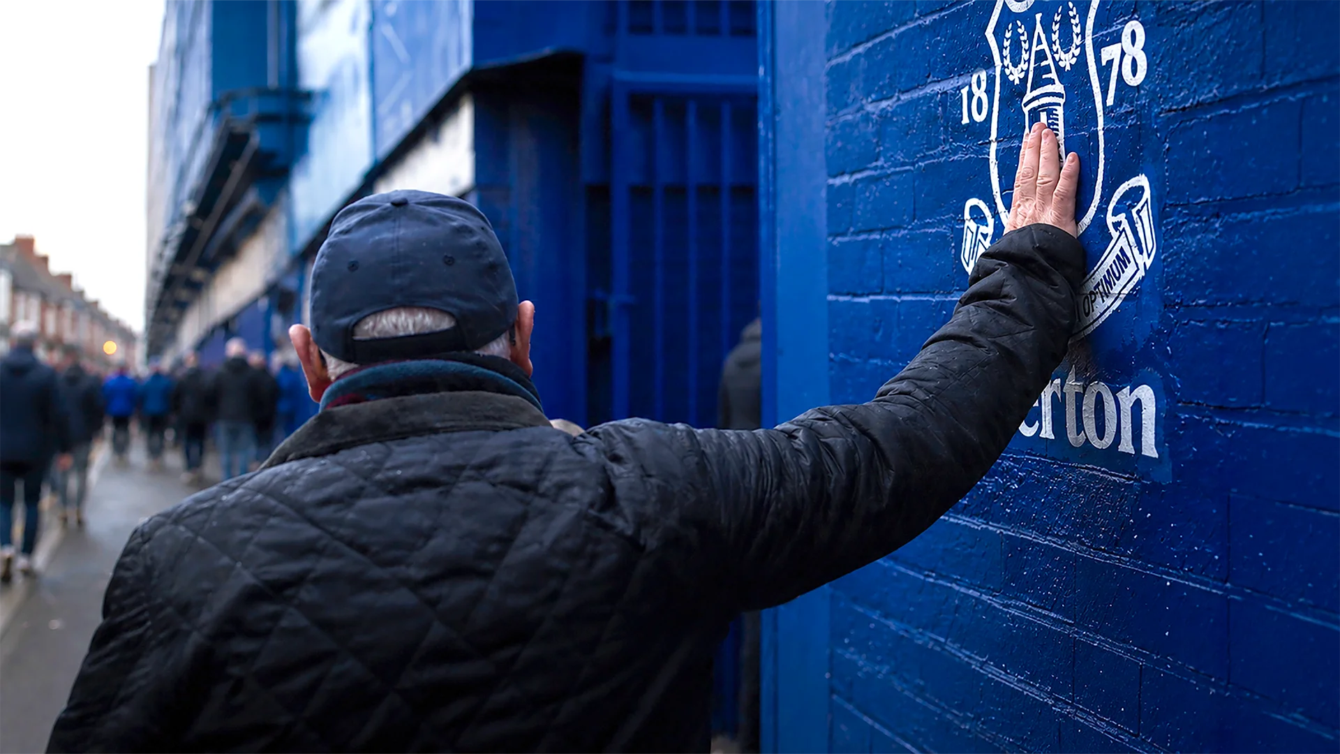
Everton’s identity was fragmented across campaigns and channels. The brief: one system connecting the club to its fans every day, not just on matchday.
Insight
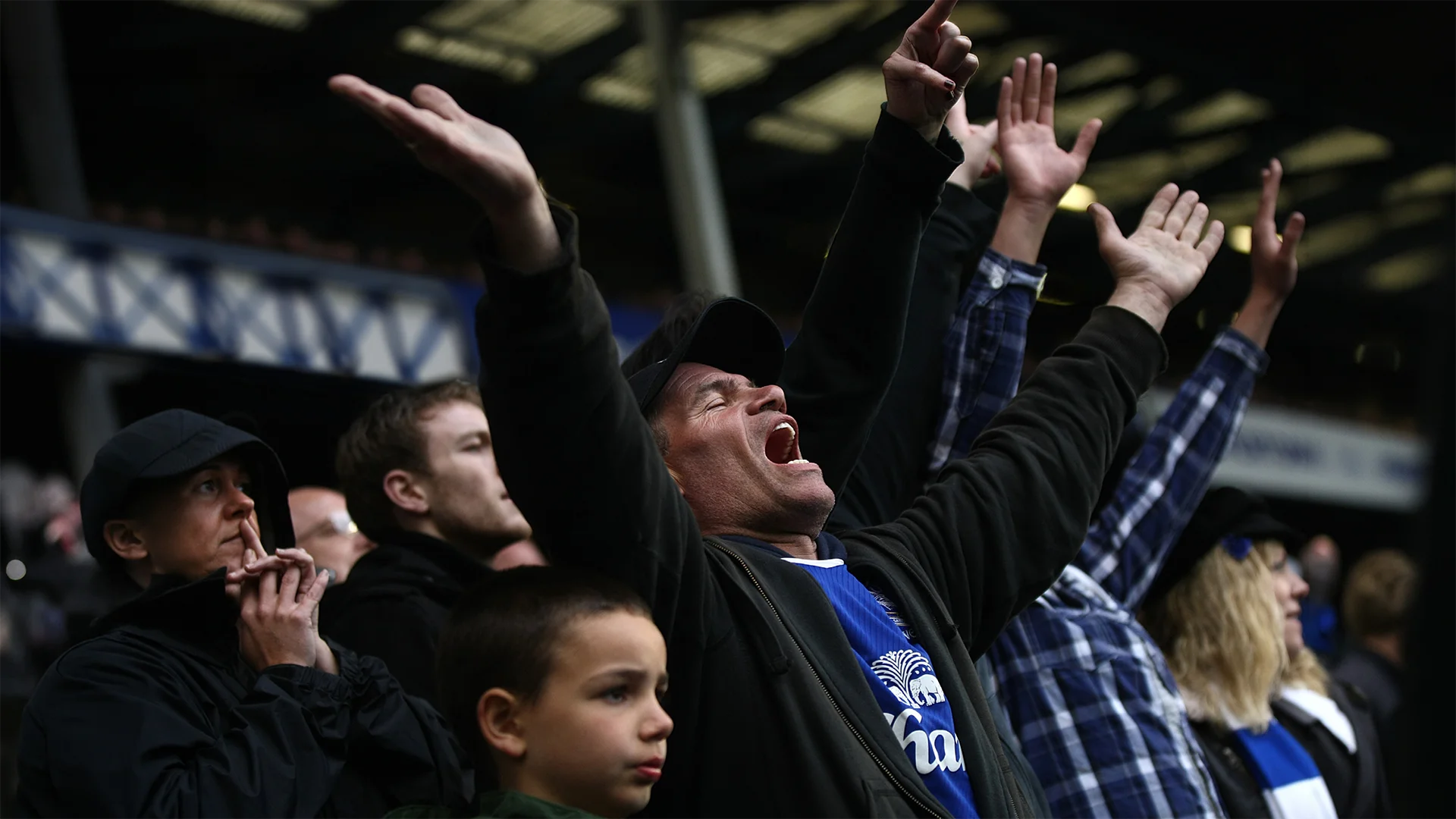
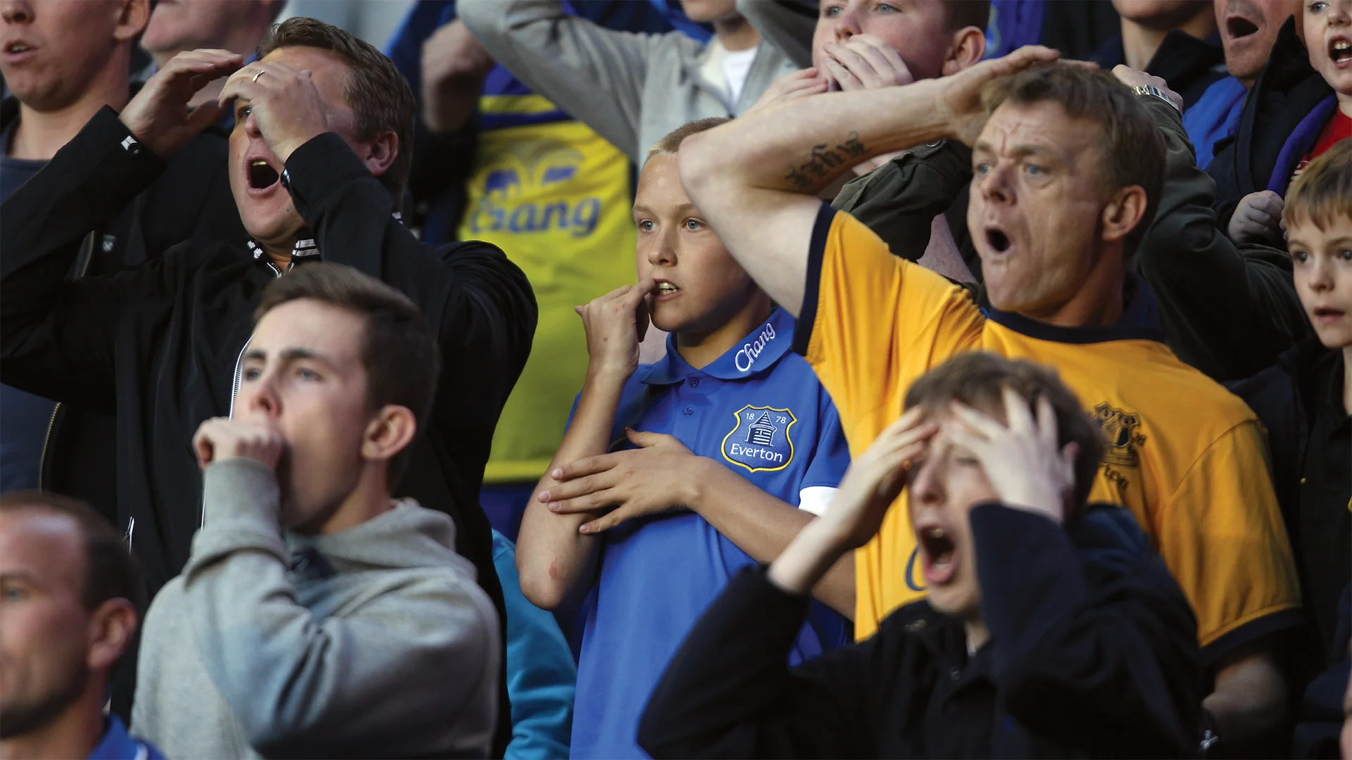
Everton’s identity doesn’t live in a logo or a strapline. It lives in what fans say, sing and do.
The system
Three layers, built outwards from the fans:
1. Behaviour System
2. Crest Core
3. Structural Geometry
01.—Behaviour system
Voice. Participation. Belonging.
Rather than invent a new voice, the identity amplified the one Evertonians already had, across campaigns, membership and matchday.
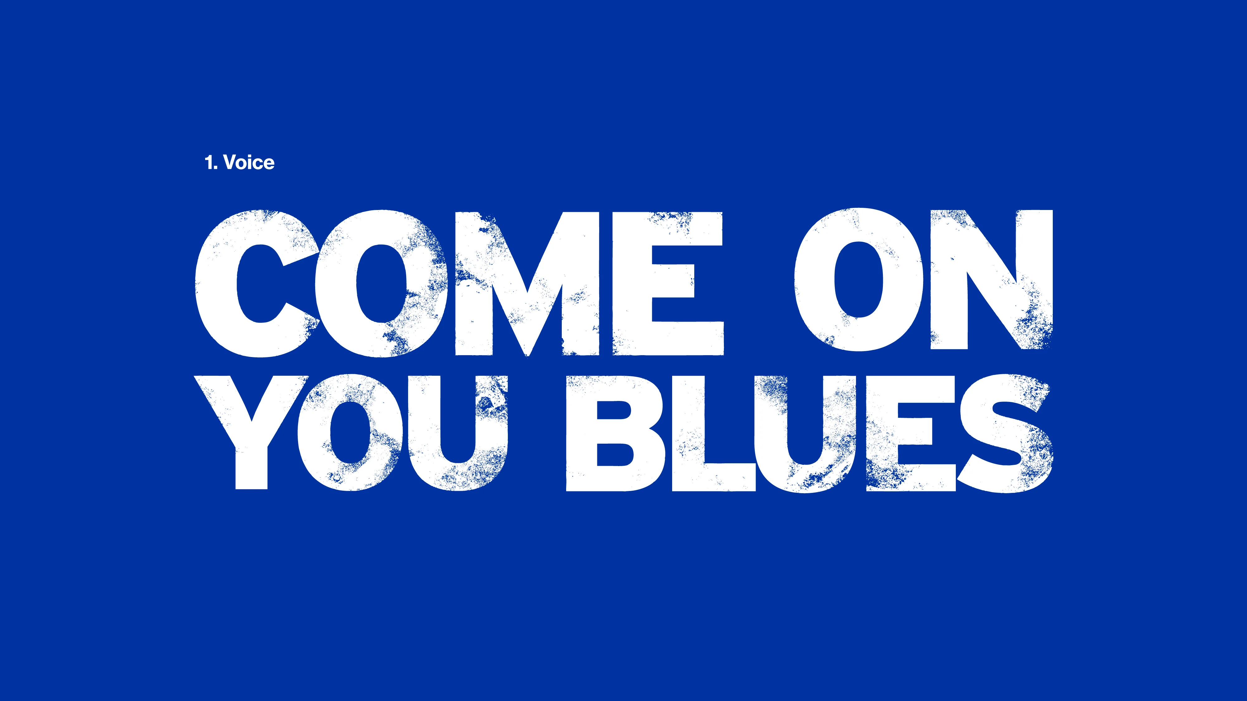
01.1— Voice
Turning supporter language into visual identity.
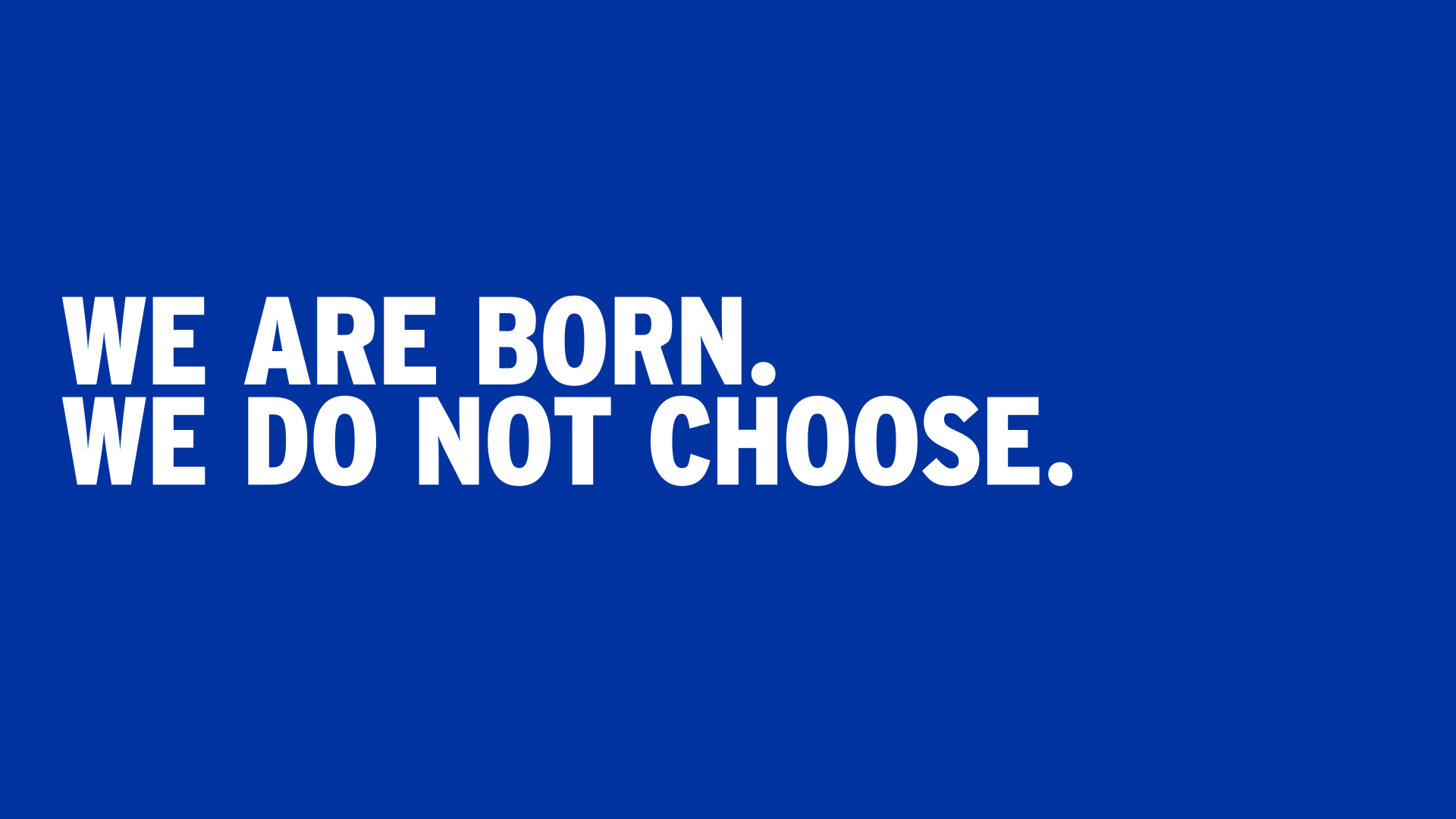
The type spoke the way fans already did: chants, sayings, terrace vernacular.
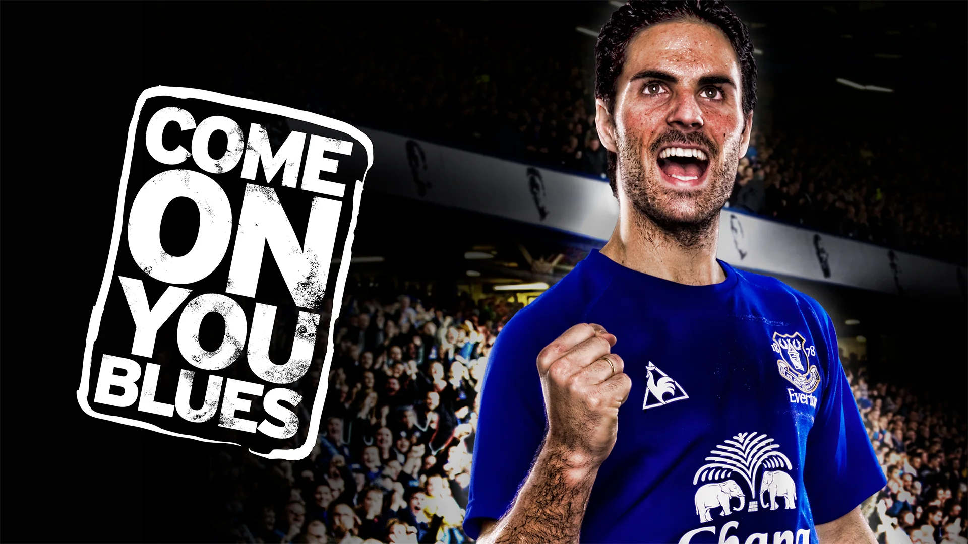
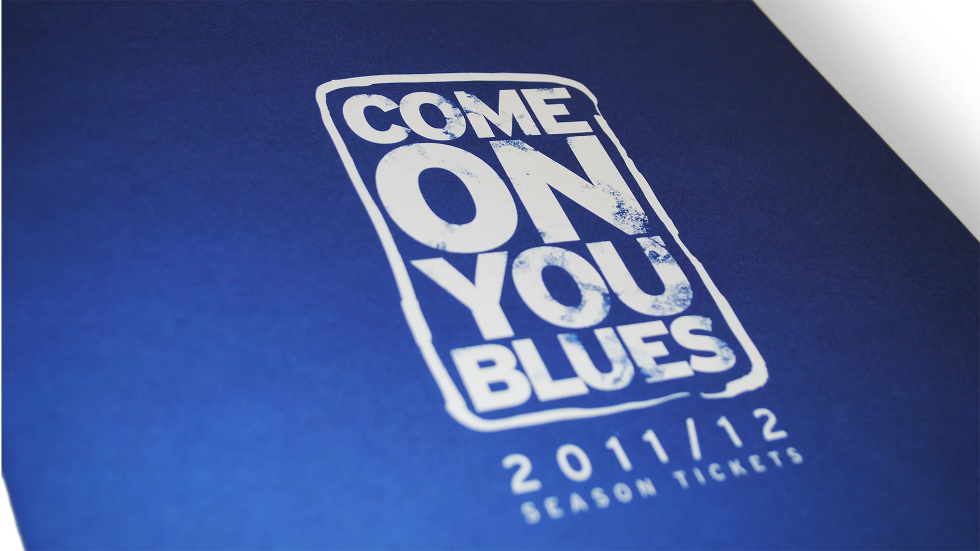
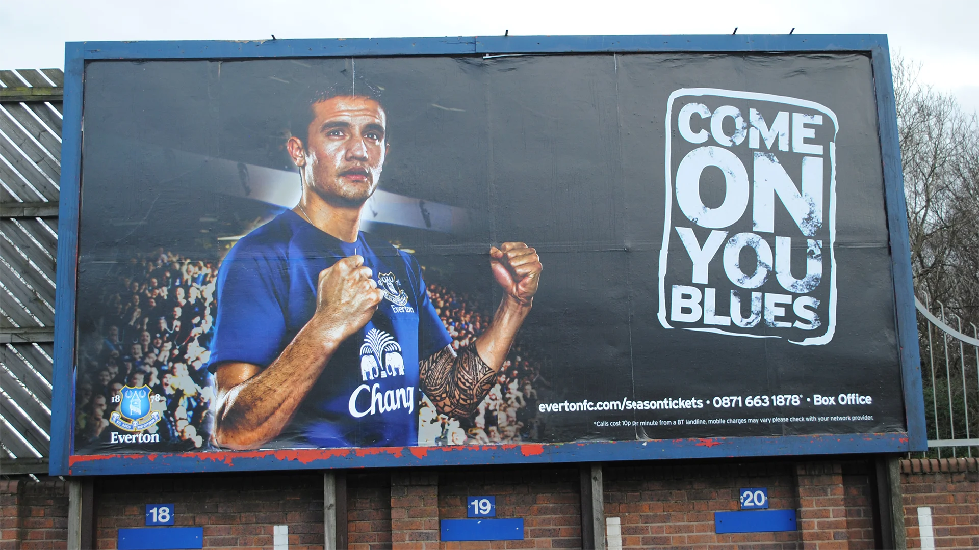
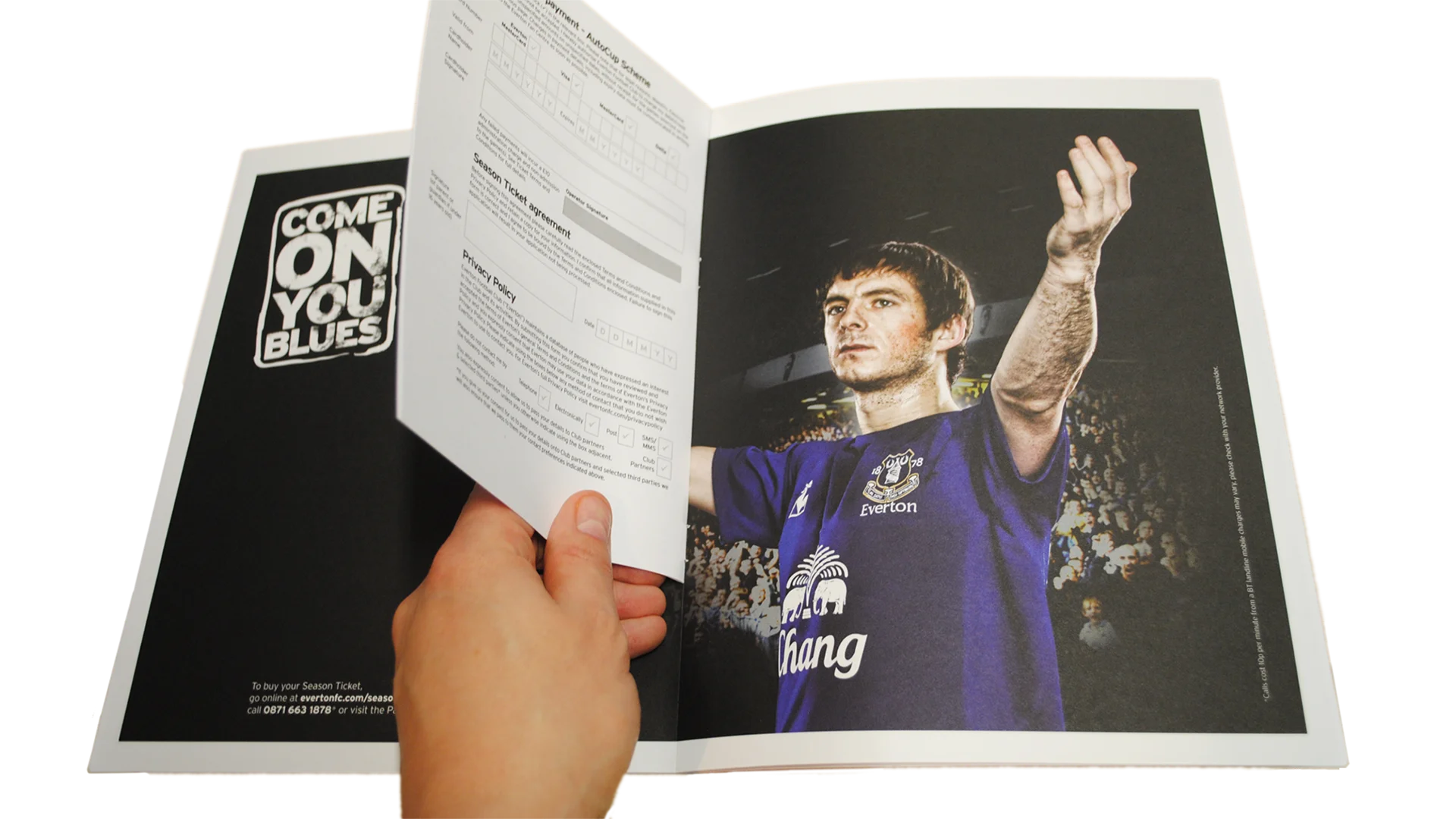
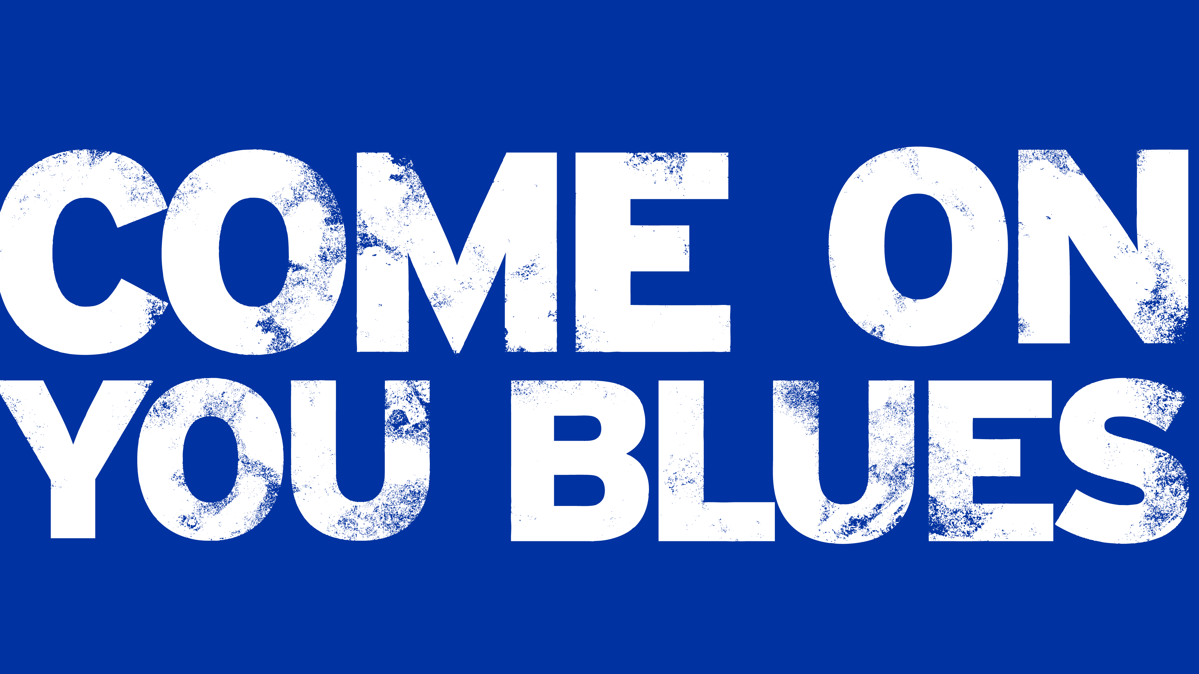
Come On You Blues
The club’s best-known chant, set as a typographic mark across stadium, print, outdoor and digital. Direct. Loud. Instantly recognisable.
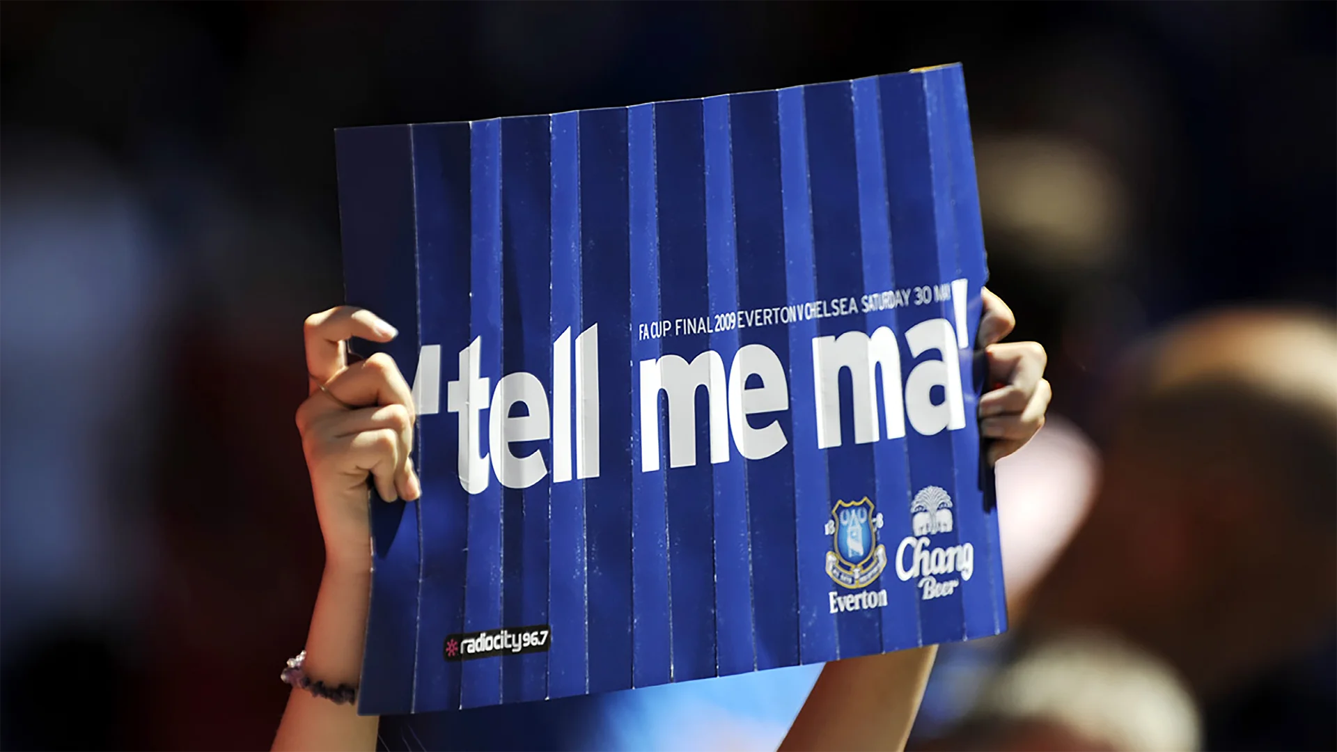
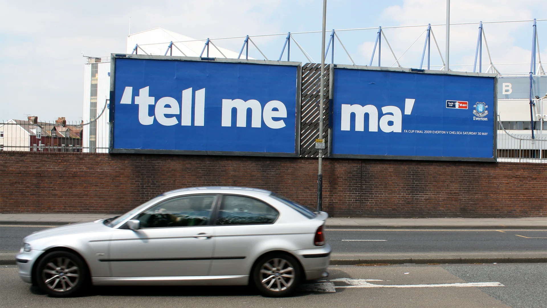
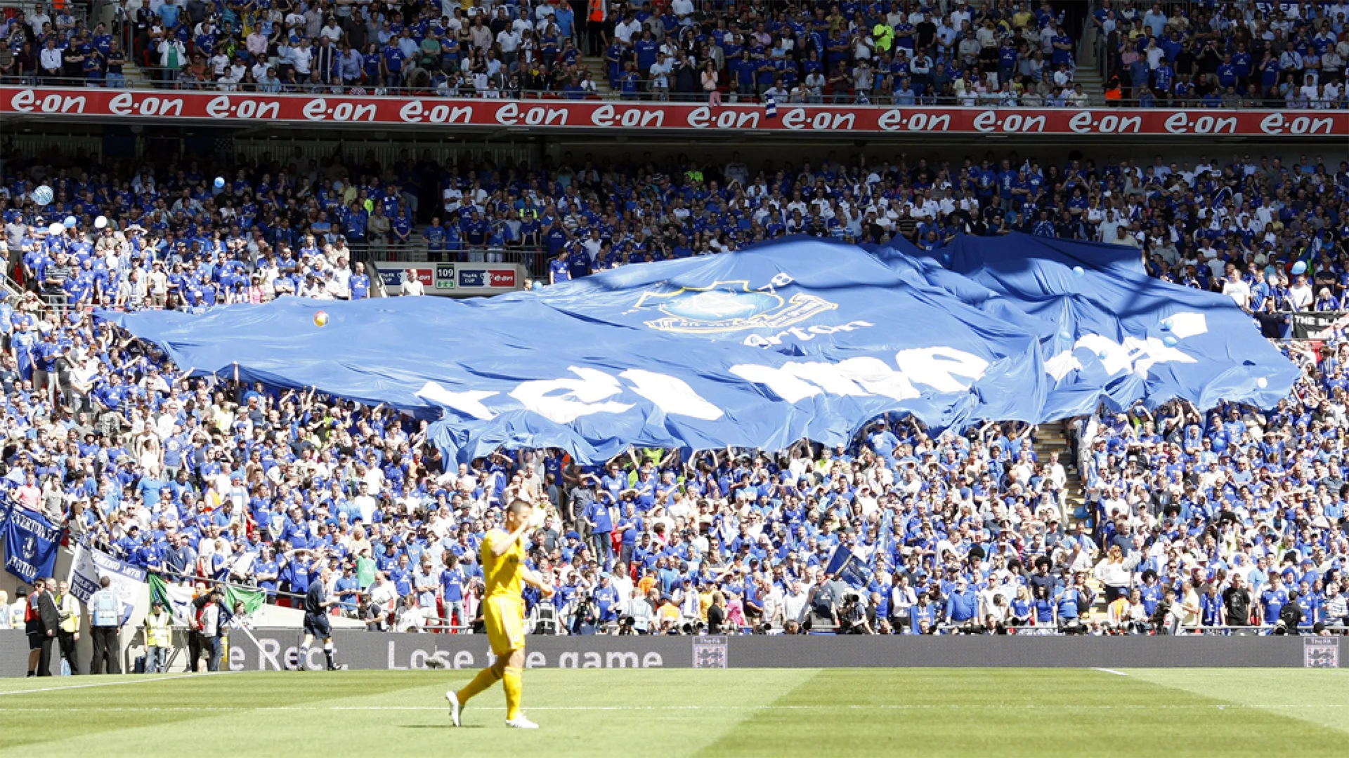
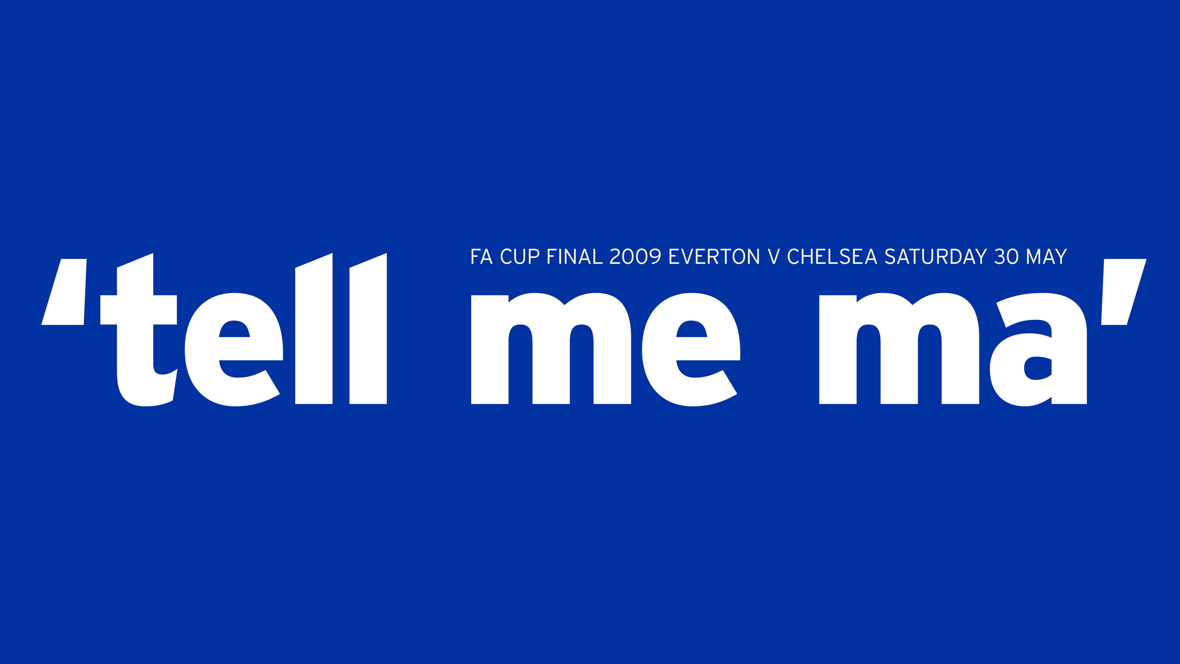
Tell me ma
Created for the 2009 FA Cup Final. An early test of the idea: a terrace song turned into something the whole end could carry.
01.2— Participation
Supporters became part of the identity.
Fans weren’t the audience for the campaigns. They were in them.
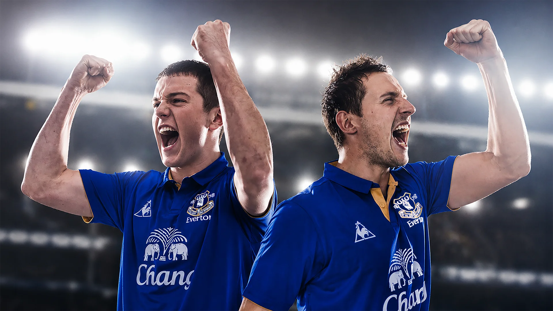
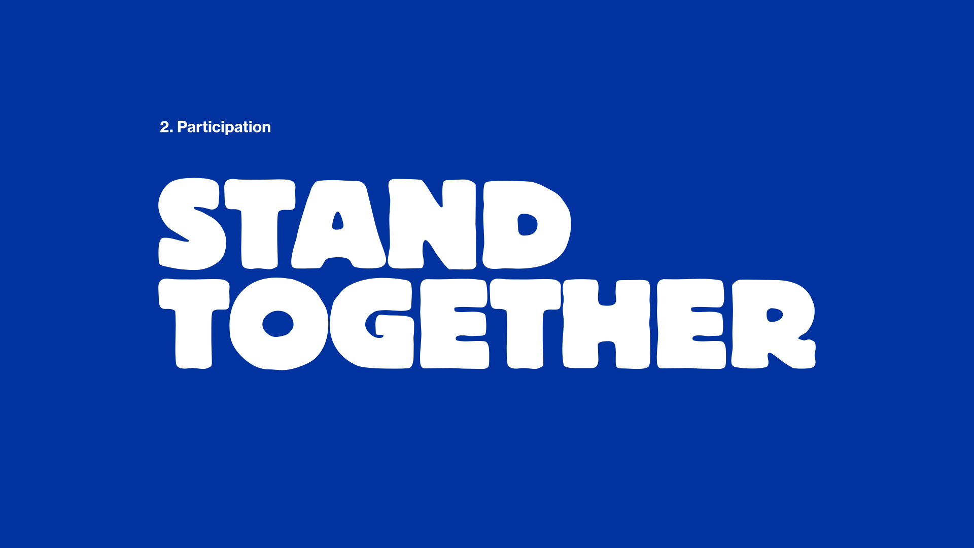
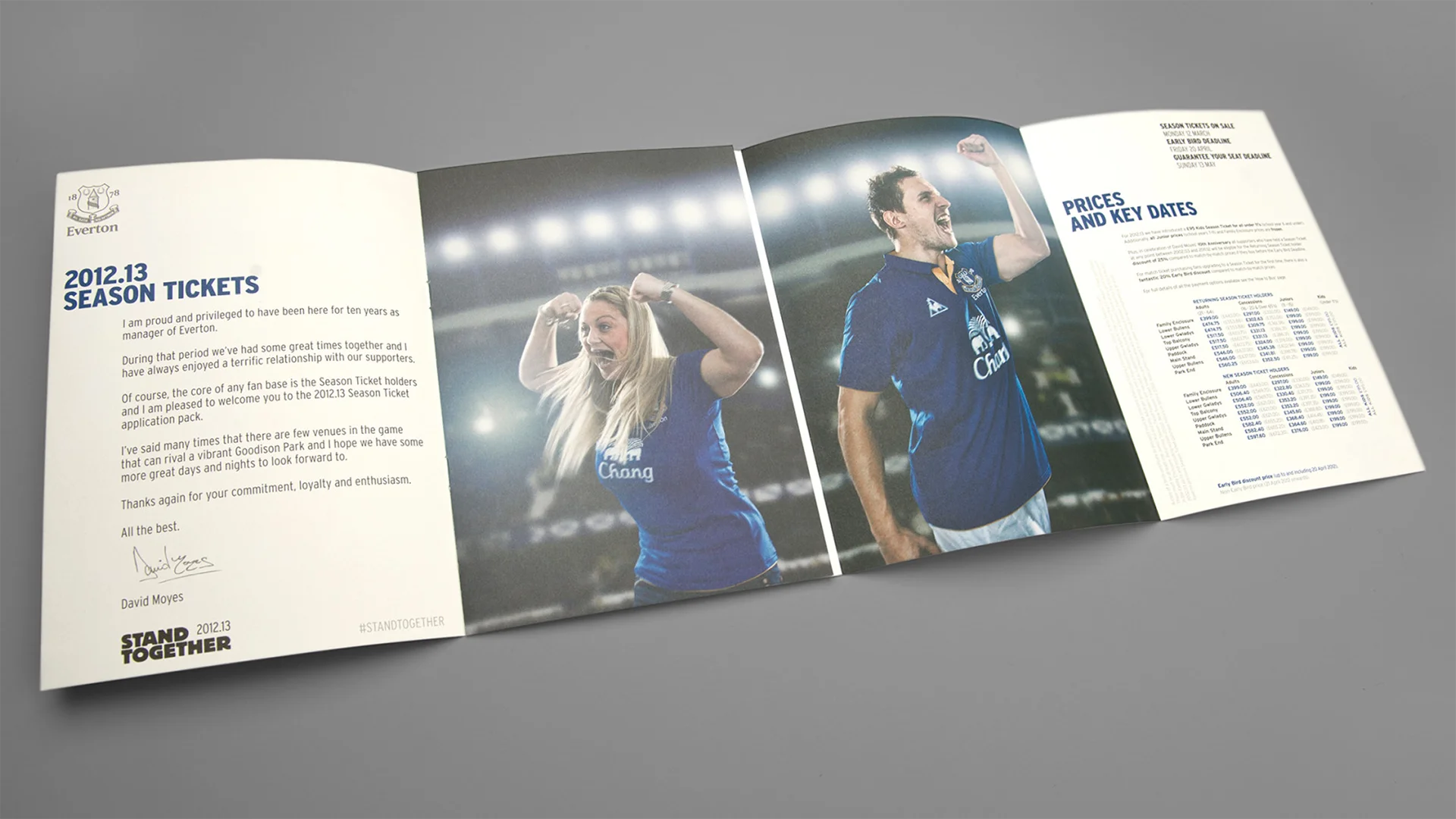
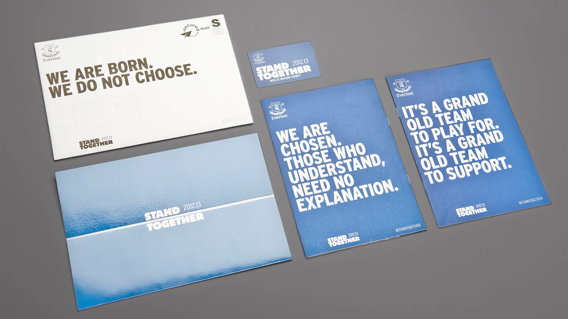
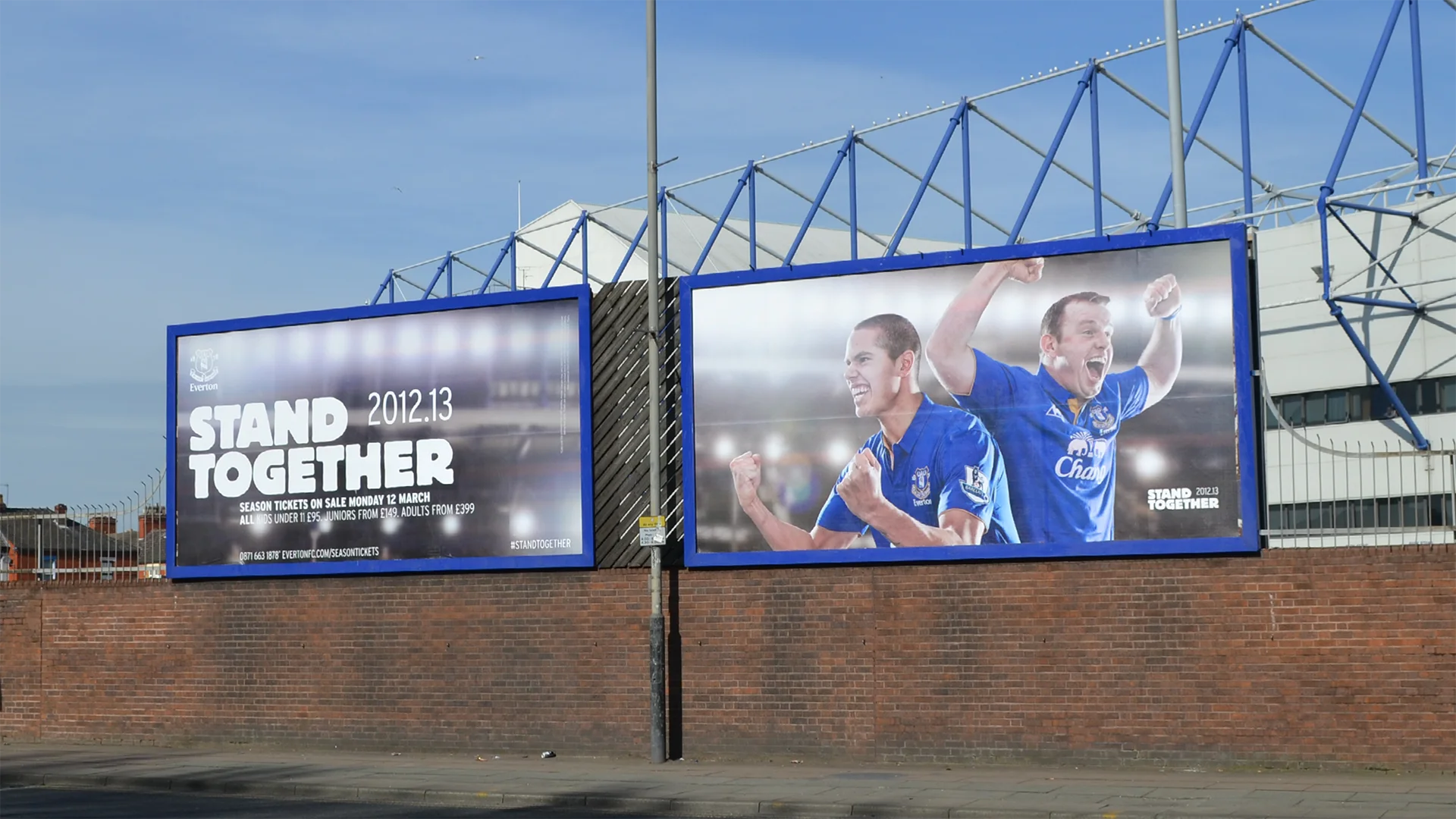
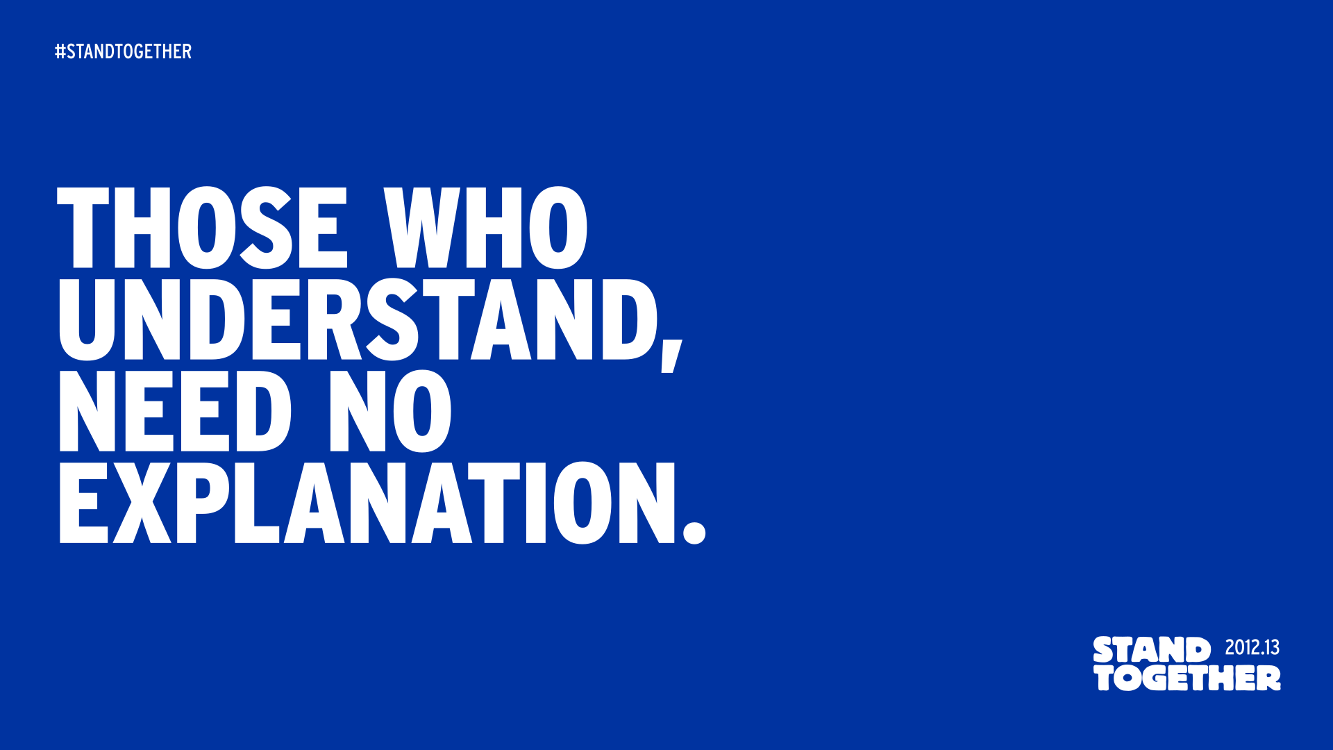
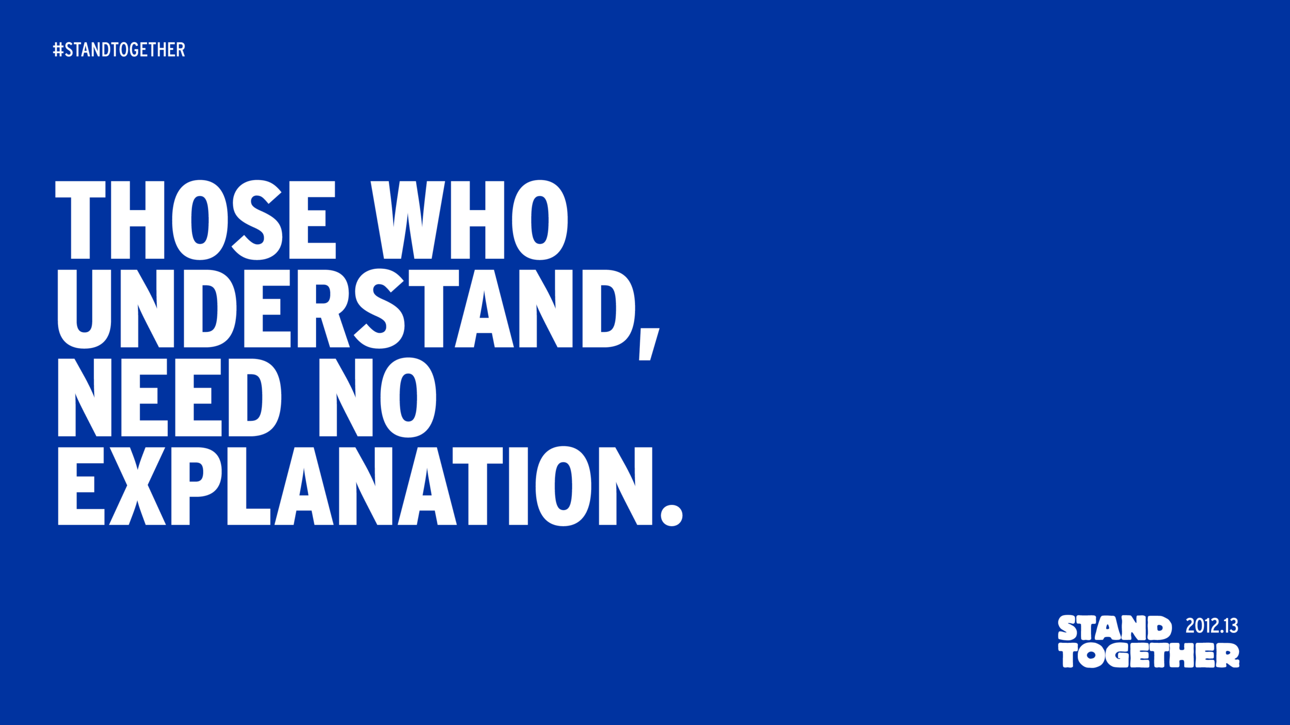
Stand Together
Made during a difficult period for the club. Fans were photographed alongside the first team, as equals.
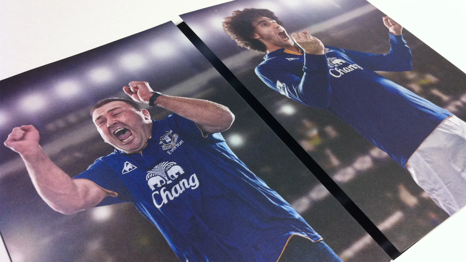
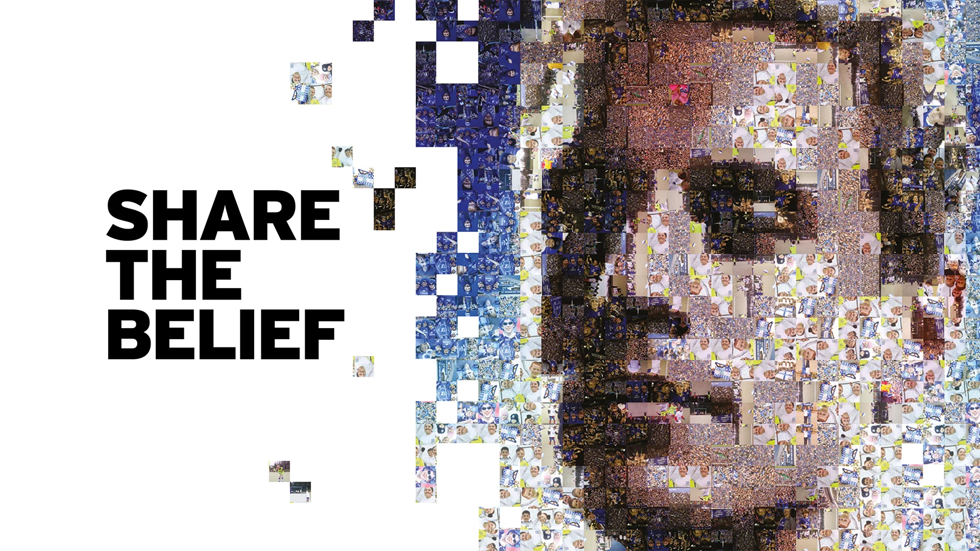
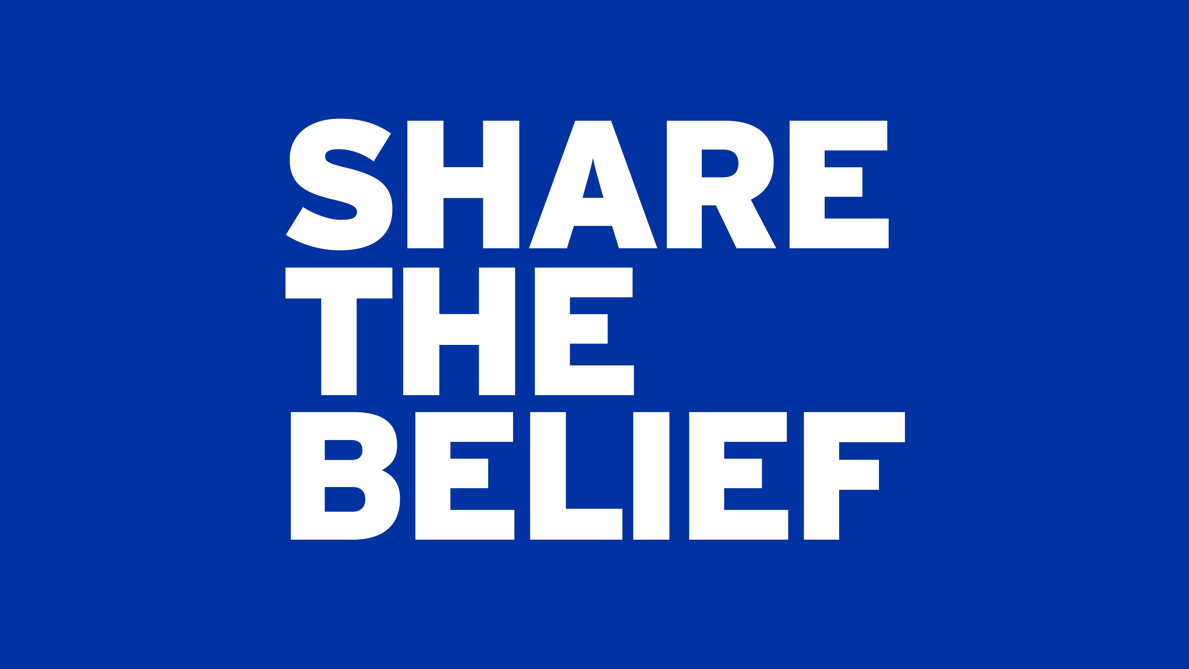
Share the Belief
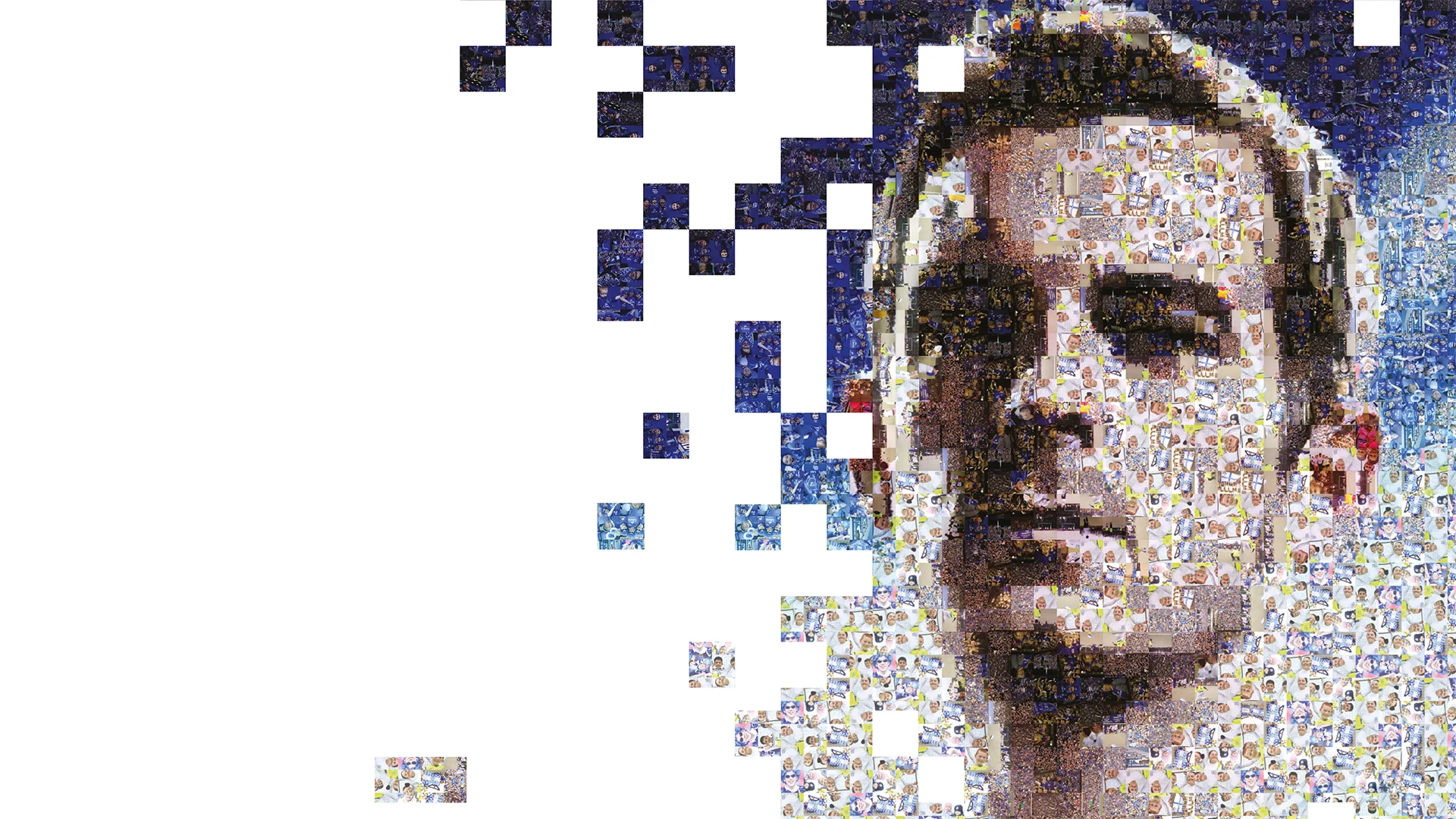
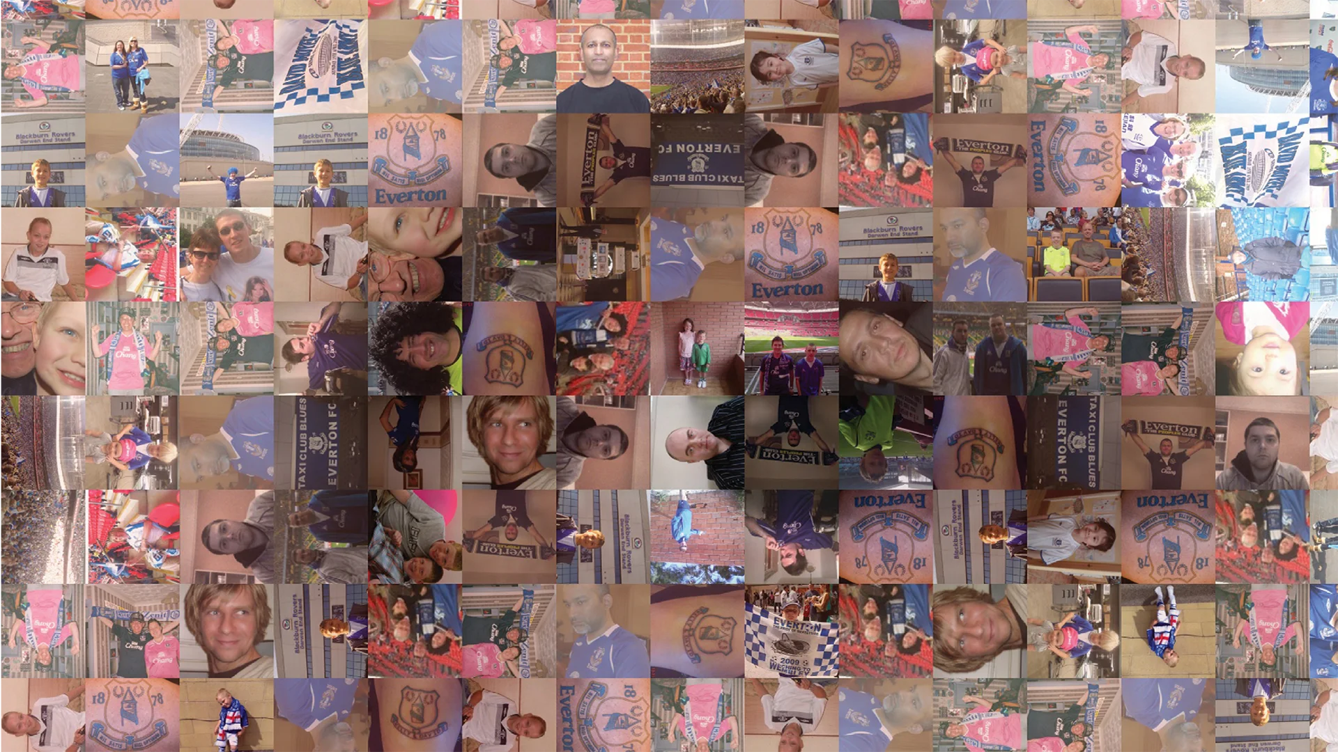
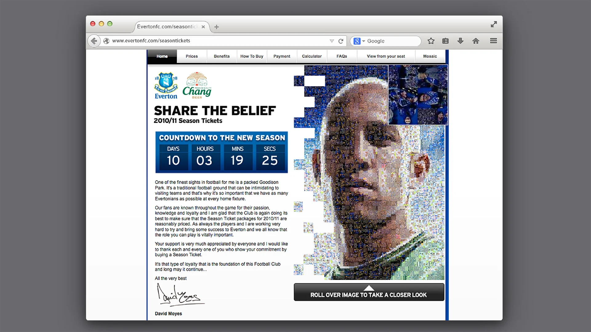
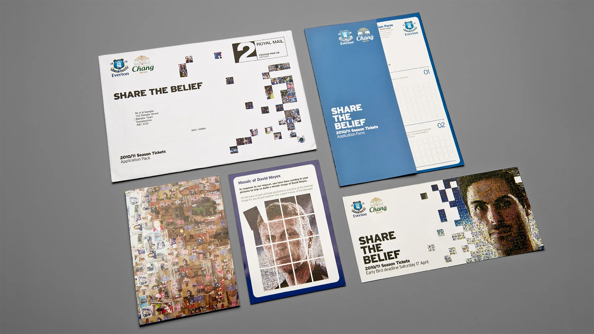
Thousands of supporter photos built mosaic portraits of the players. Fans didn’t appear in the campaign. They were the campaign.
01.3— Belonging
Identity beyond the campaign.
Beyond season-ticket sales: loyalty, ritual and what it means to be an Evertonian.
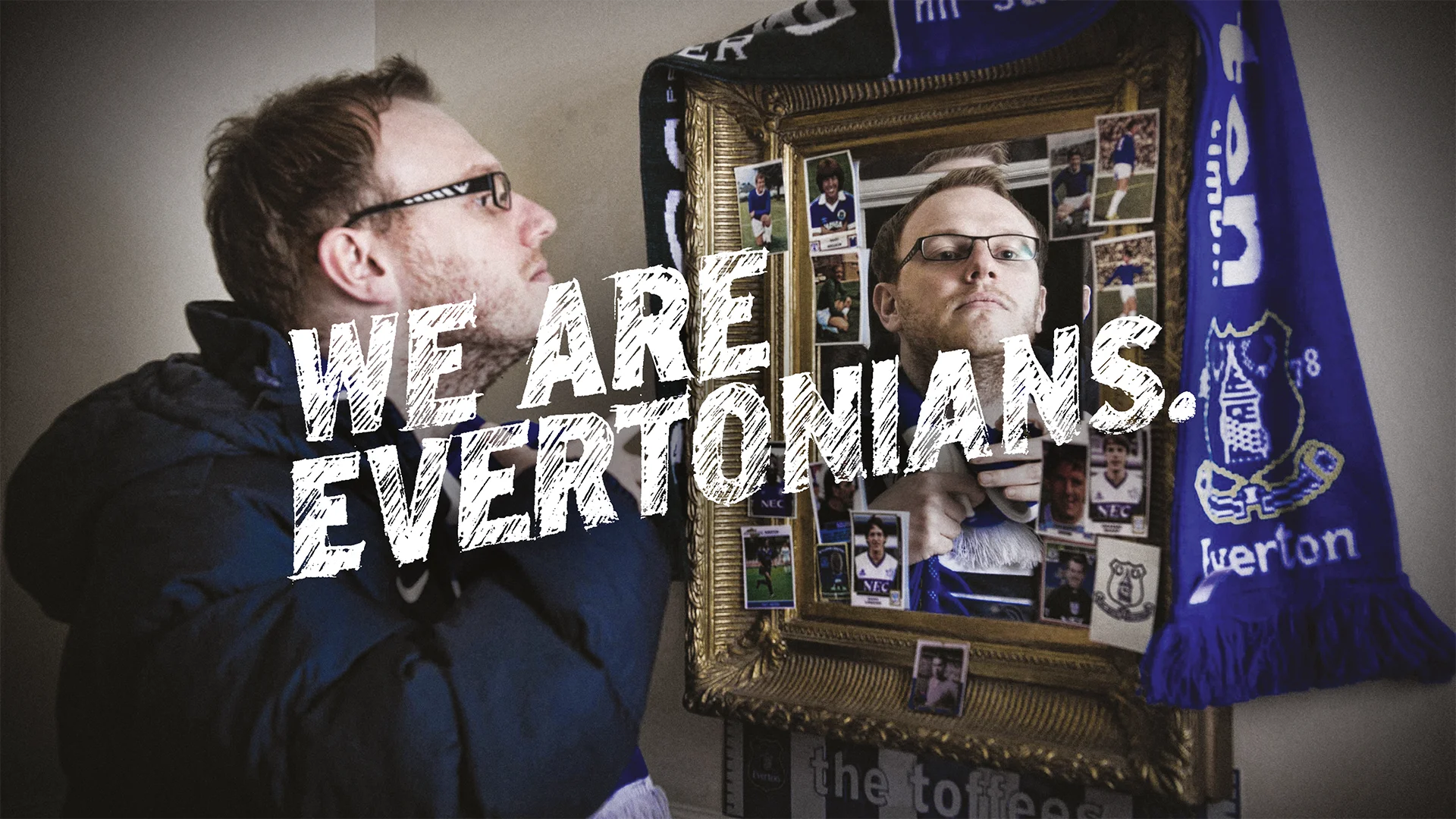
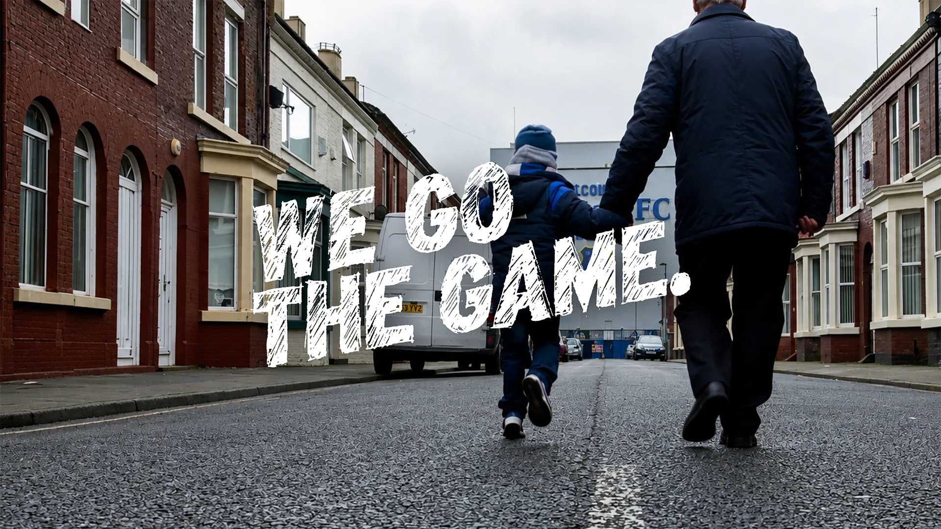
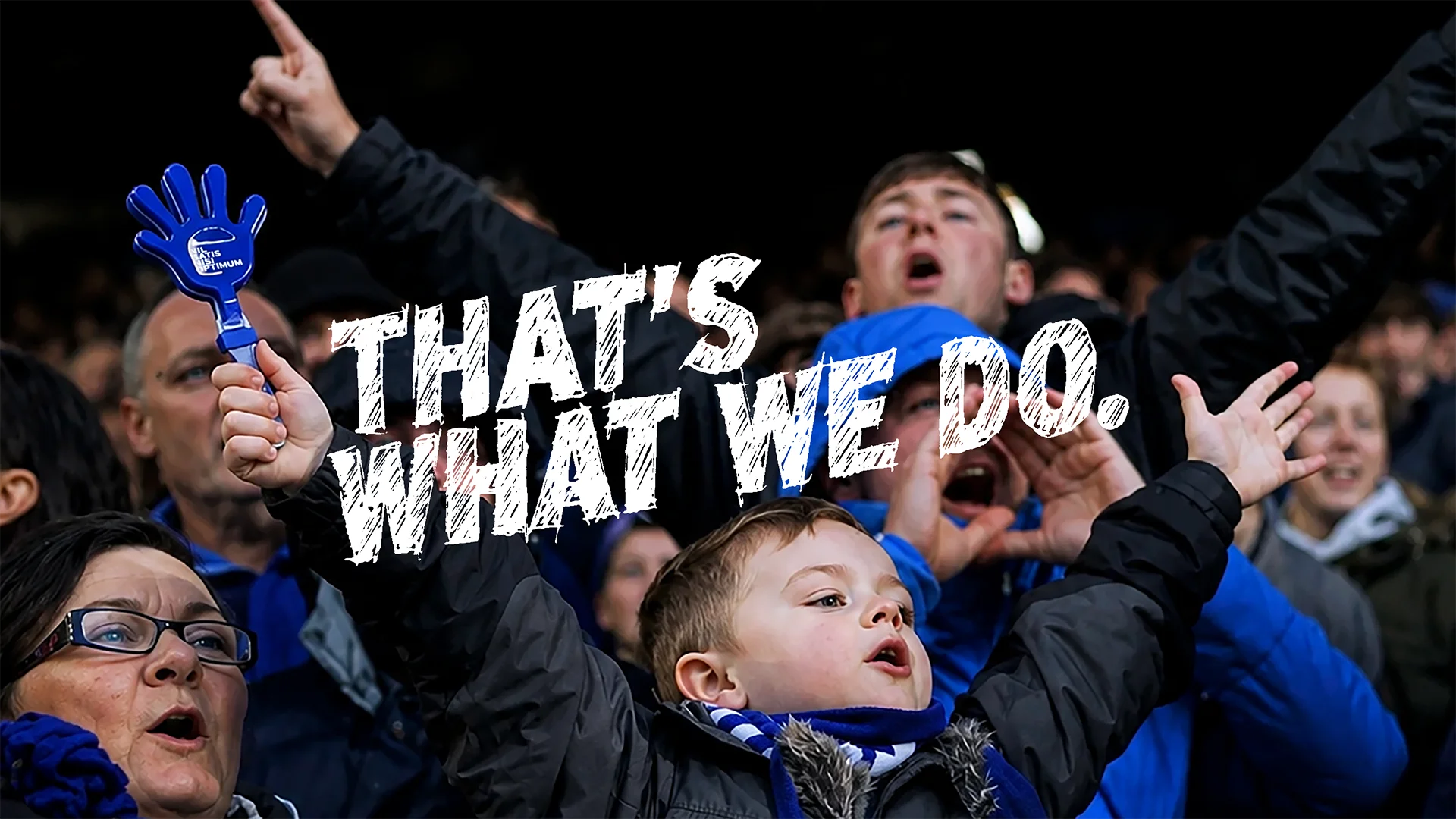
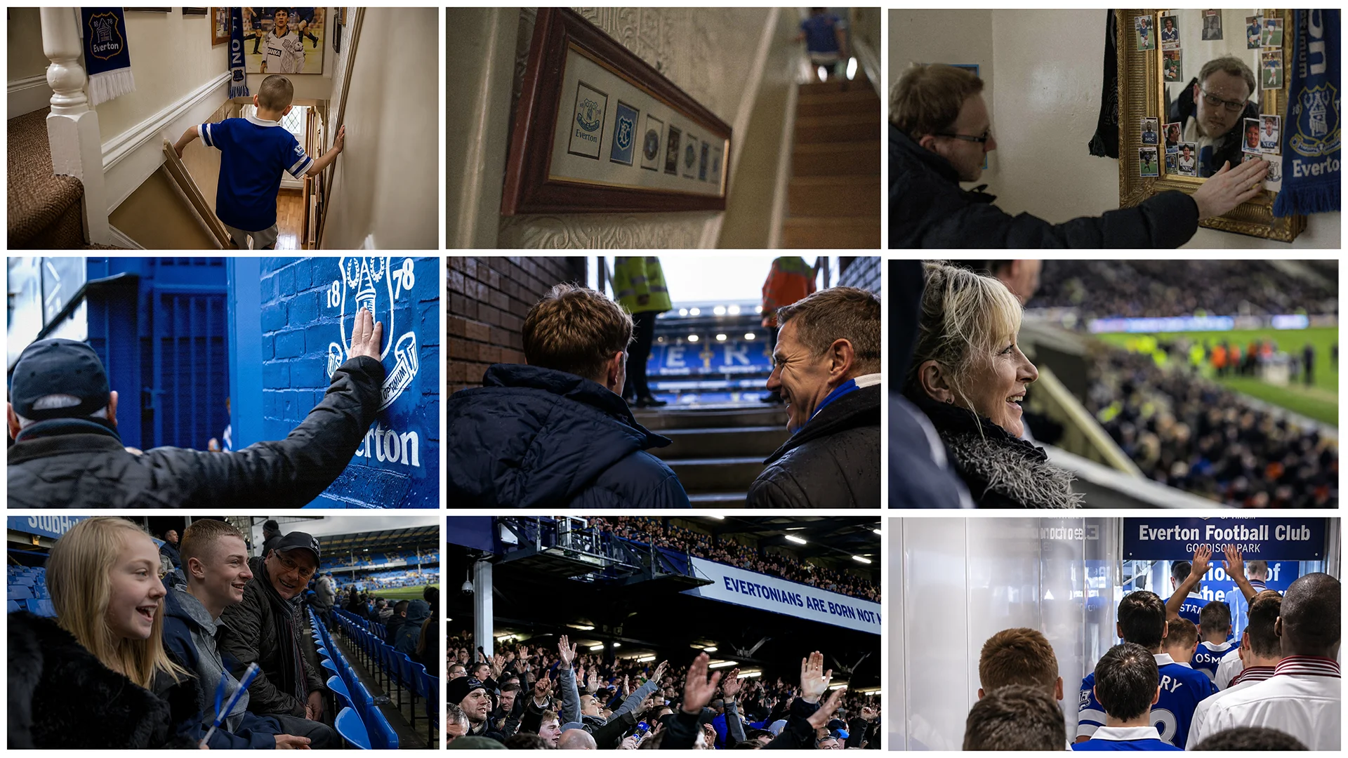
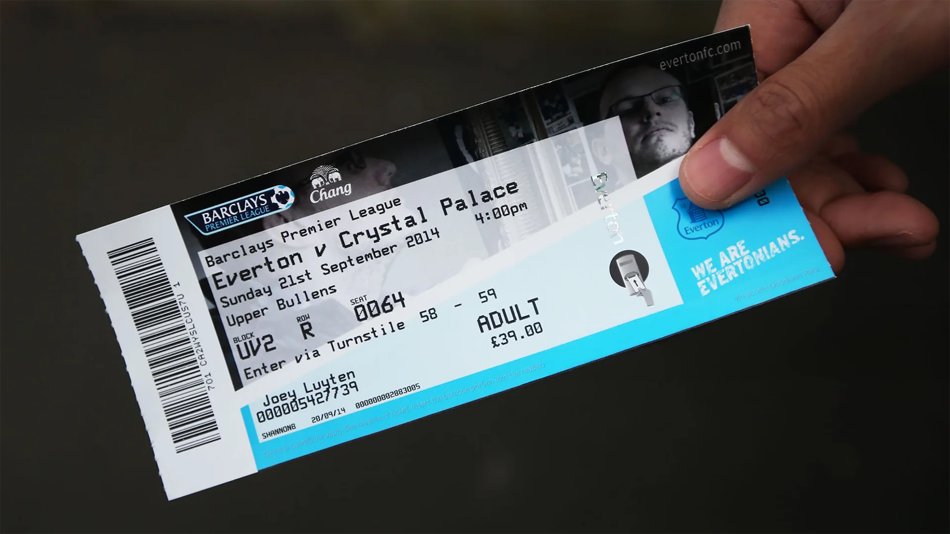
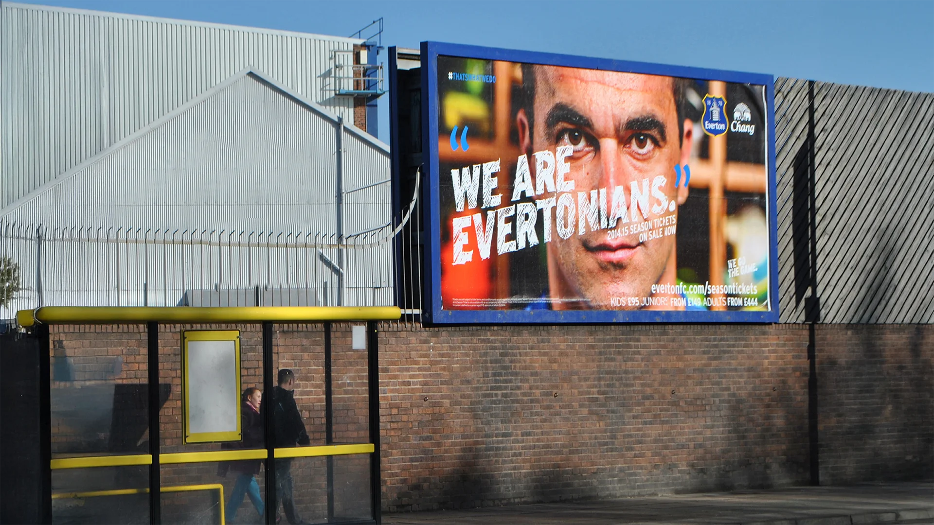
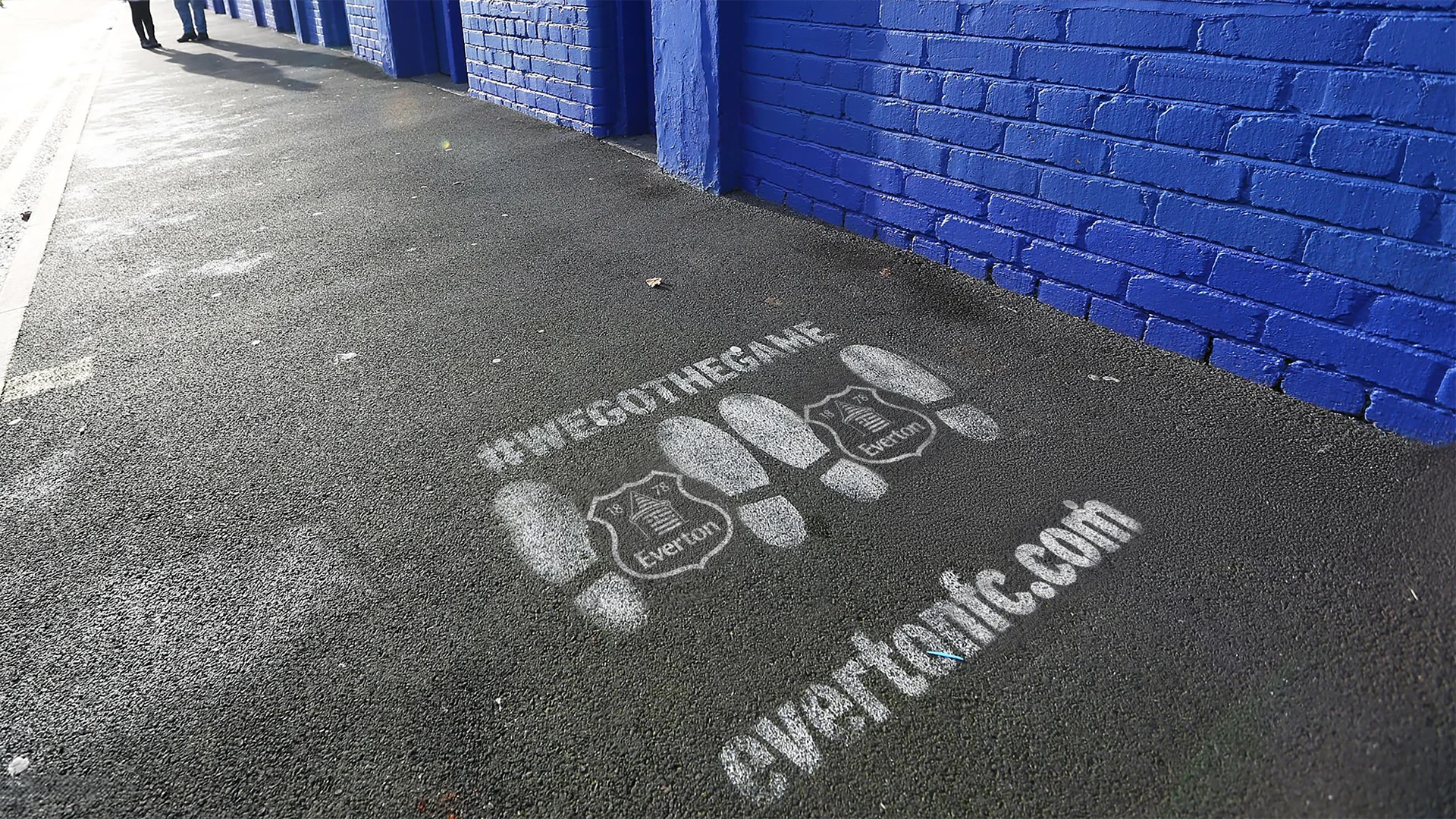
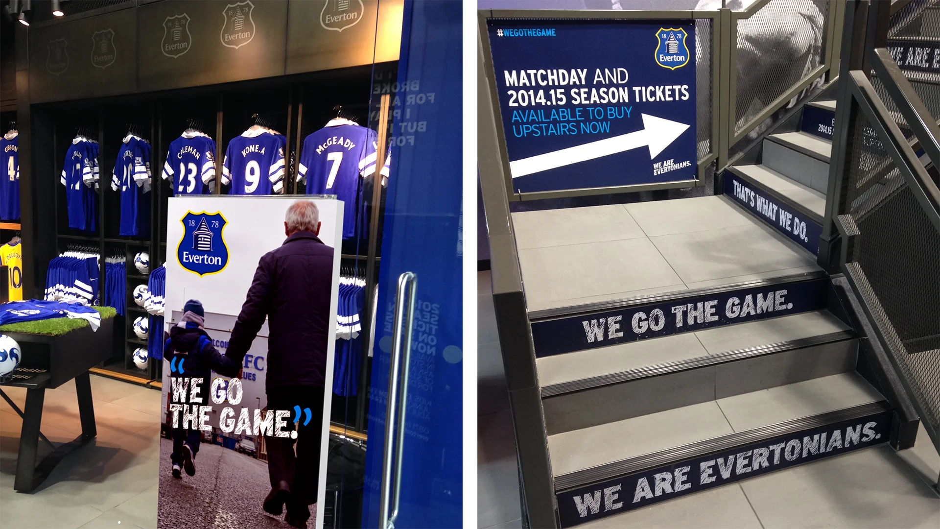
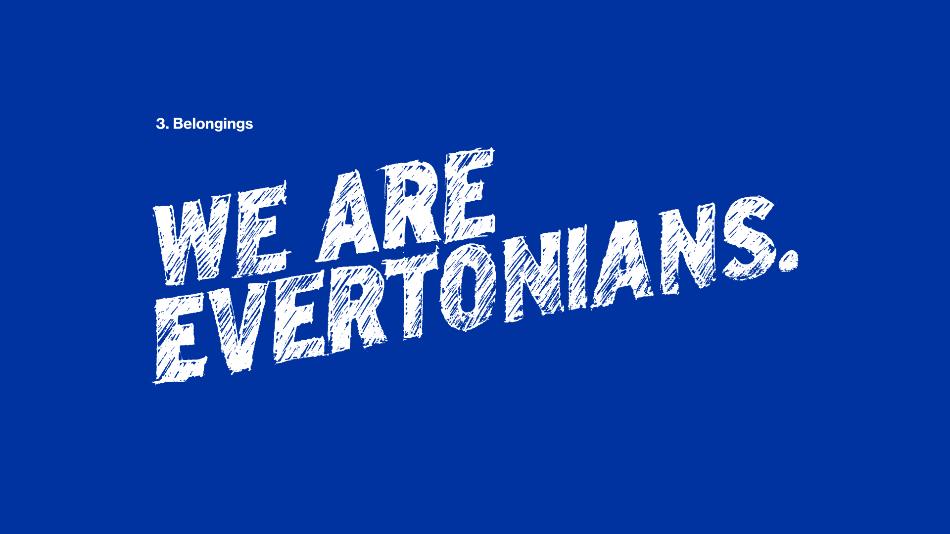
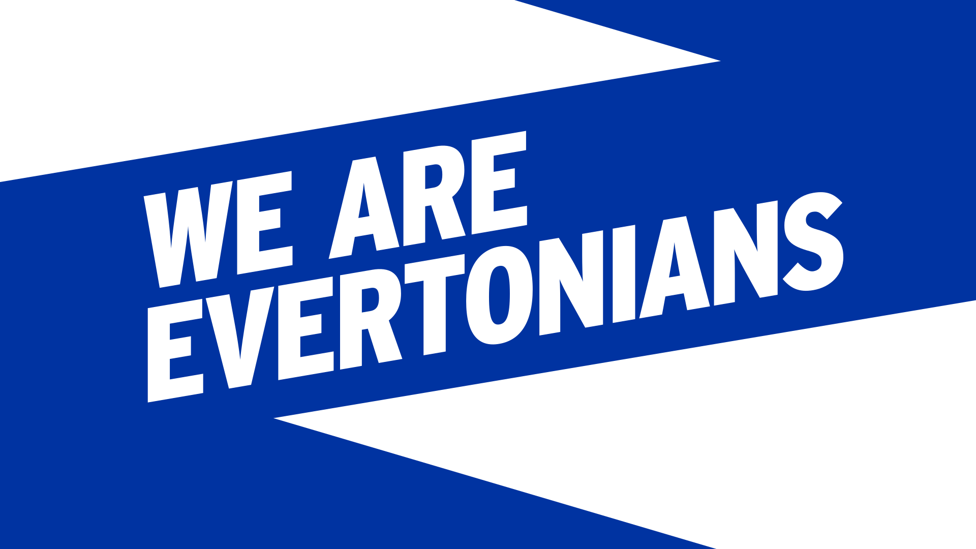
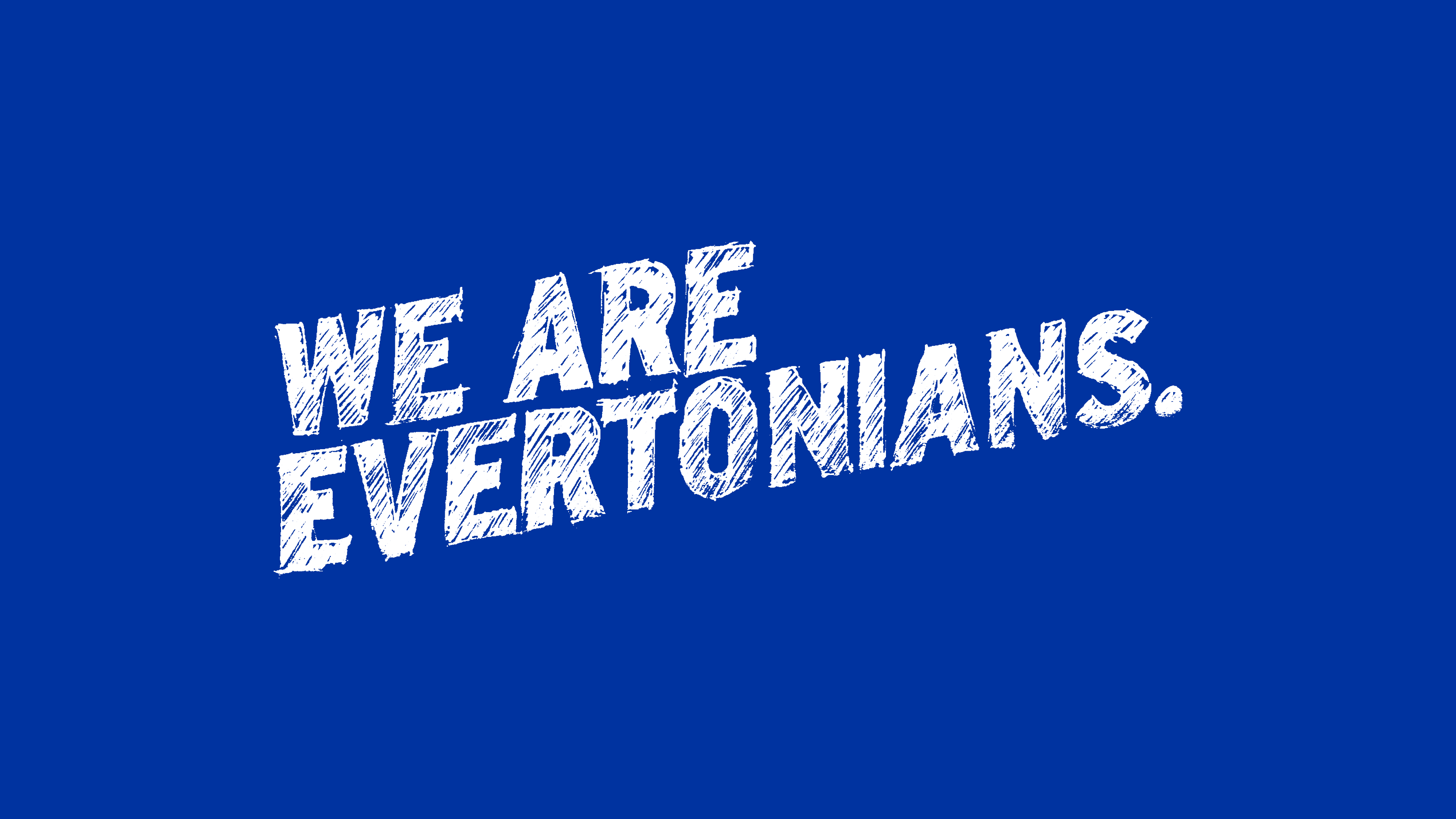
We are Evertonians
A film about the rituals and superstitions of real Evertonians, not players. We go the game. That’s what we do.
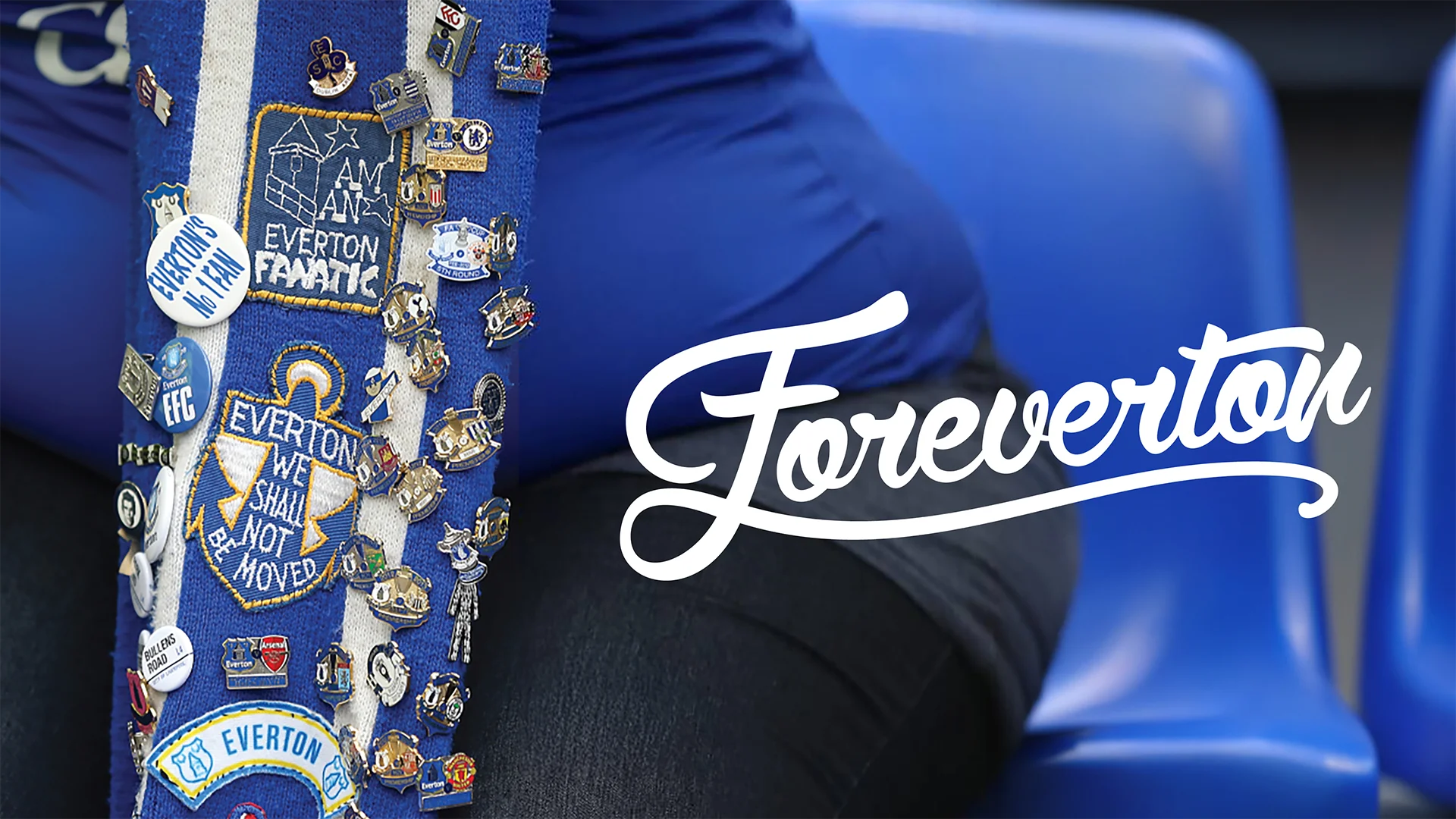
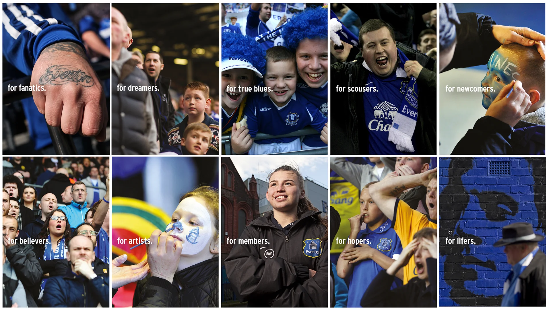
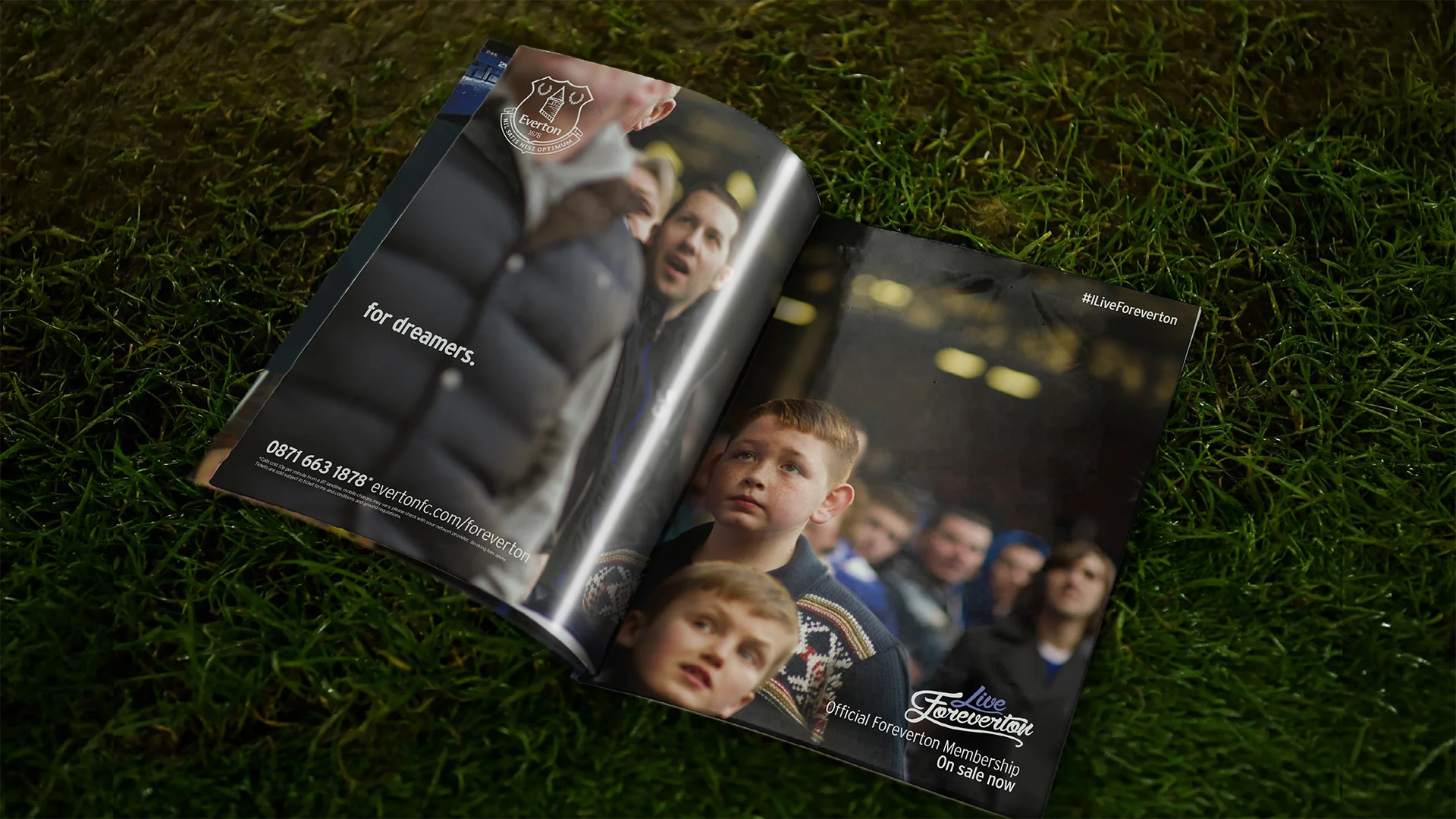
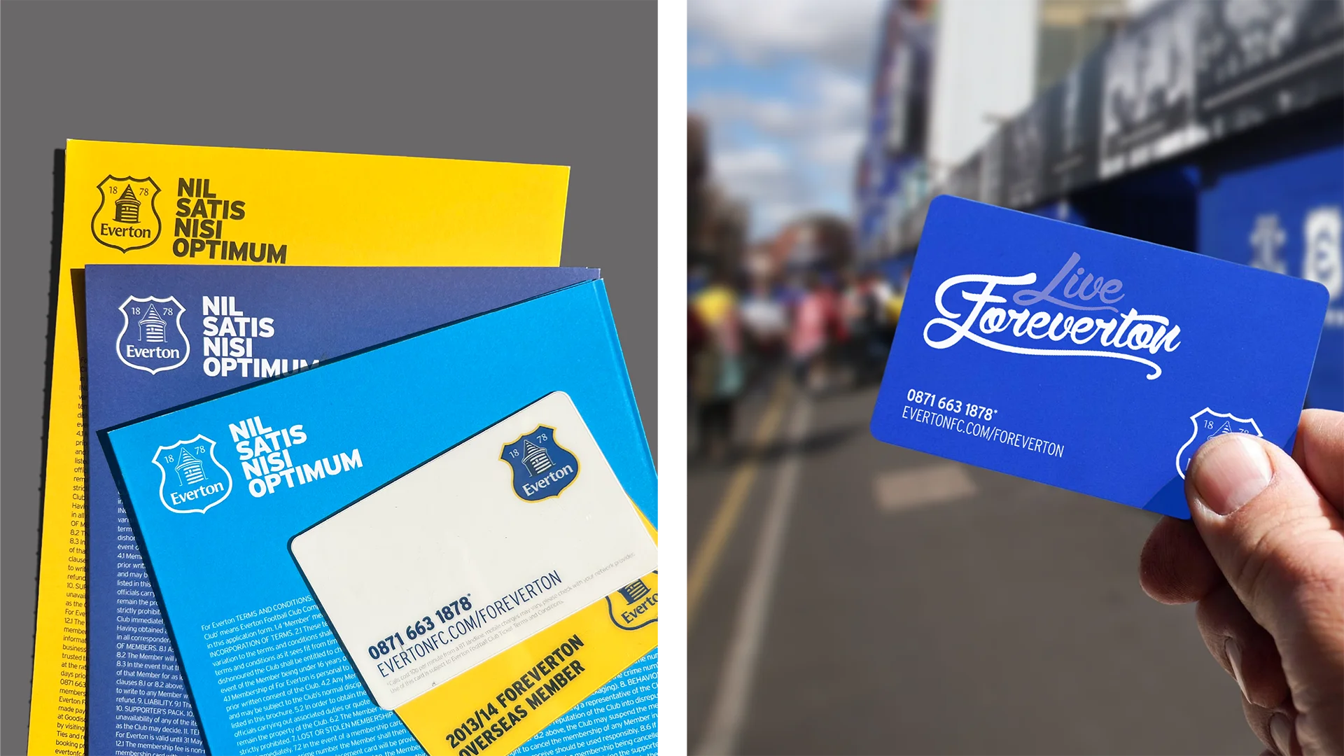
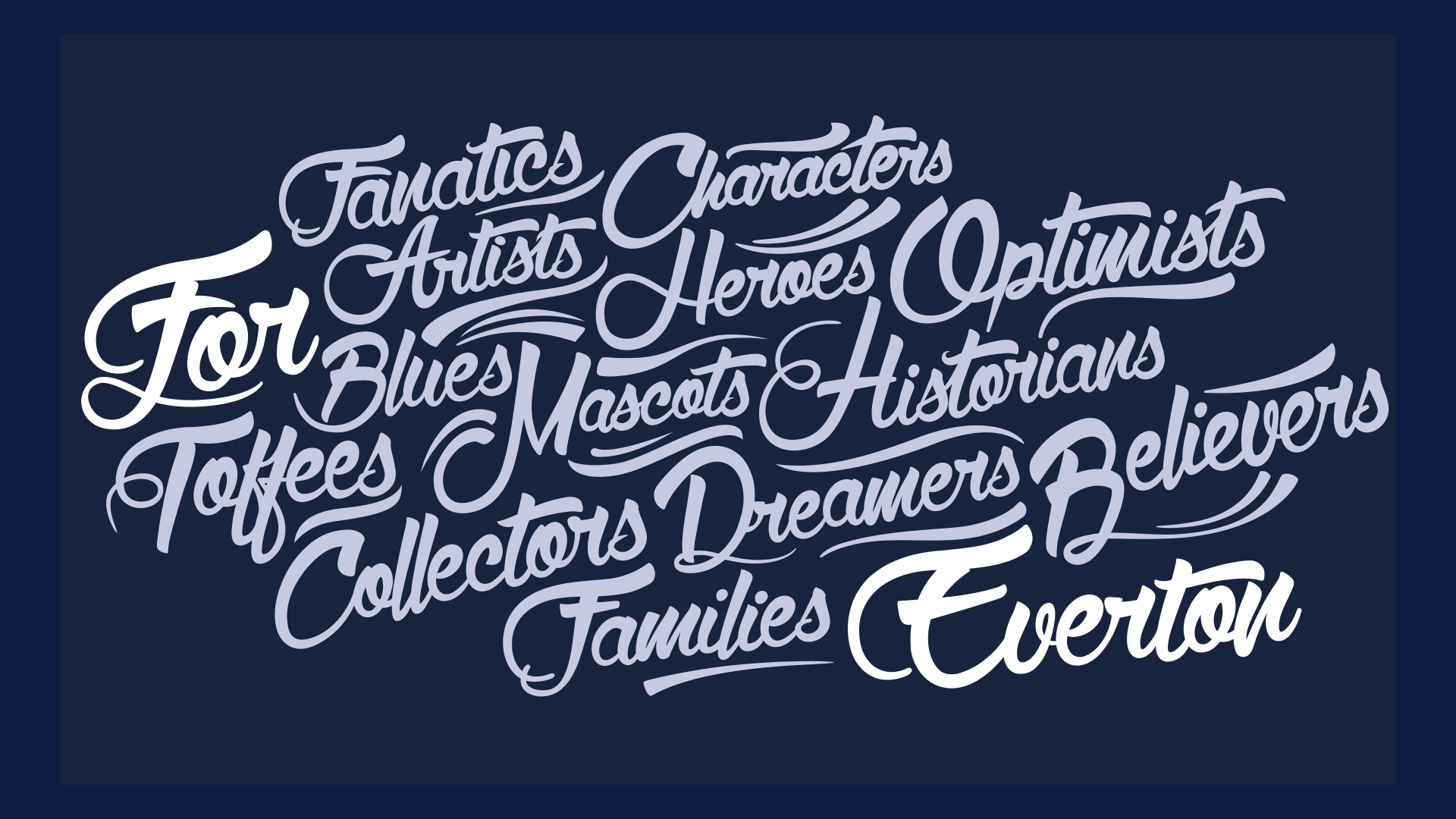
ForEverton Membership
Membership built on commitment, not attendance. For supporters who live Everton every day, season ticket or not.
02.—Crest Core
A stable identity. A flexible expression.
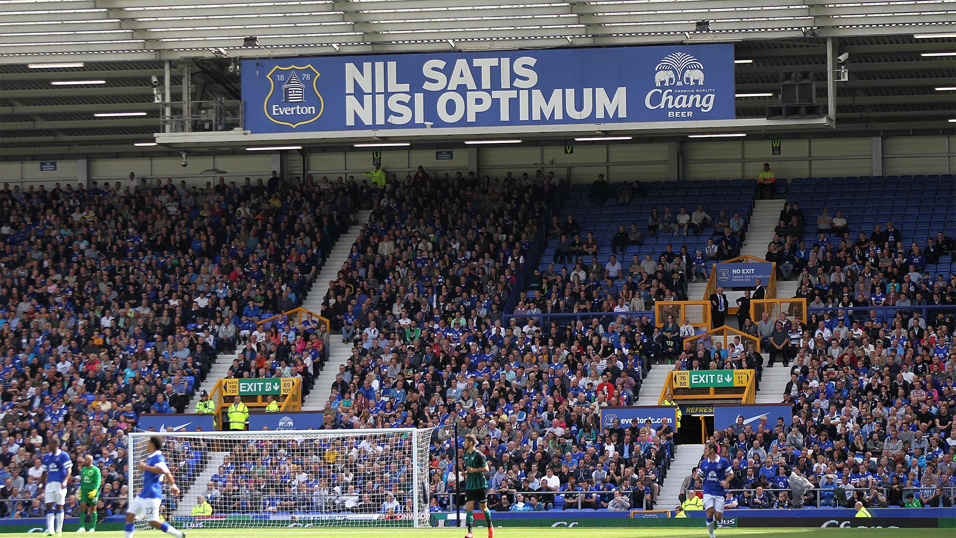
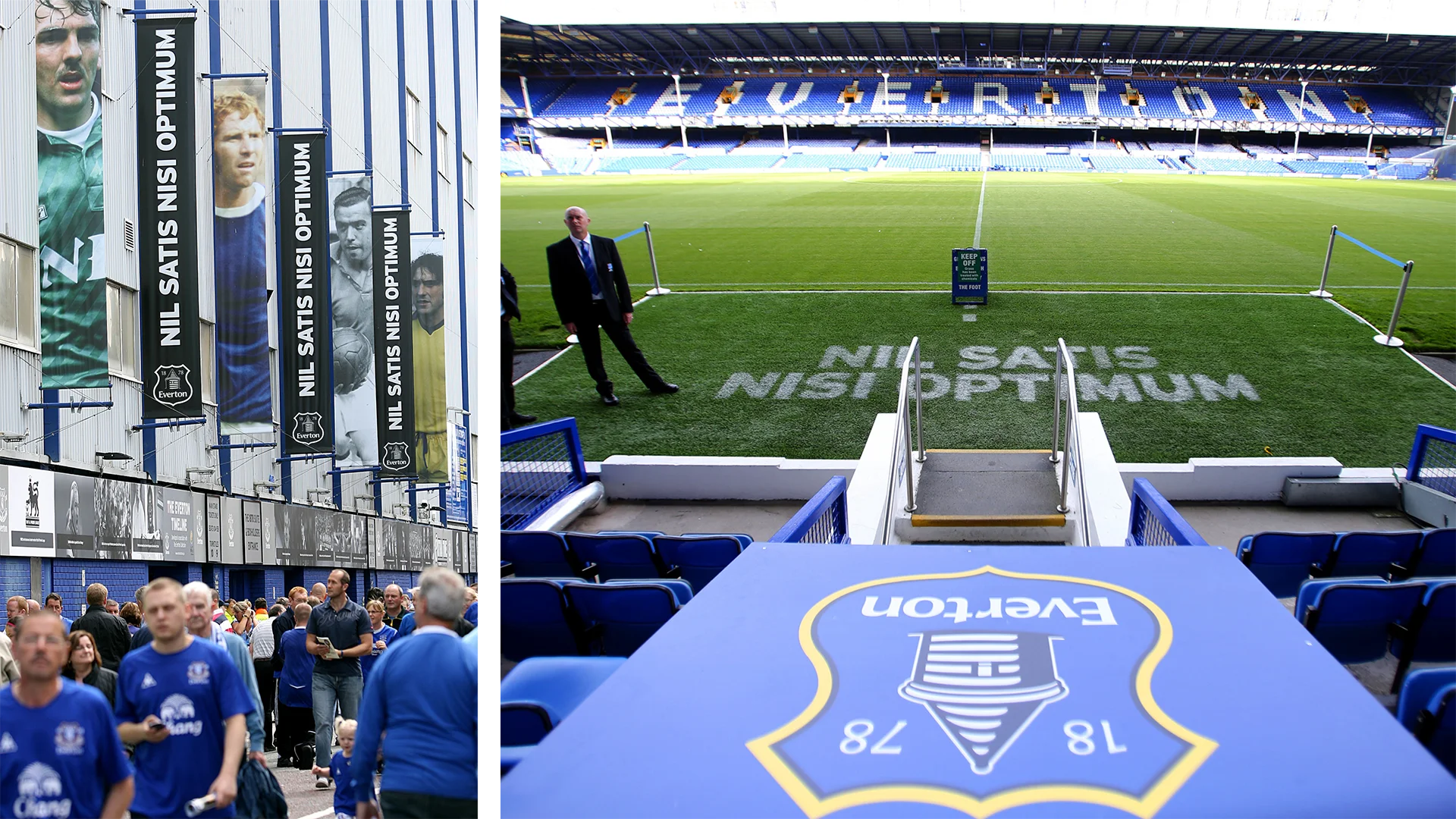
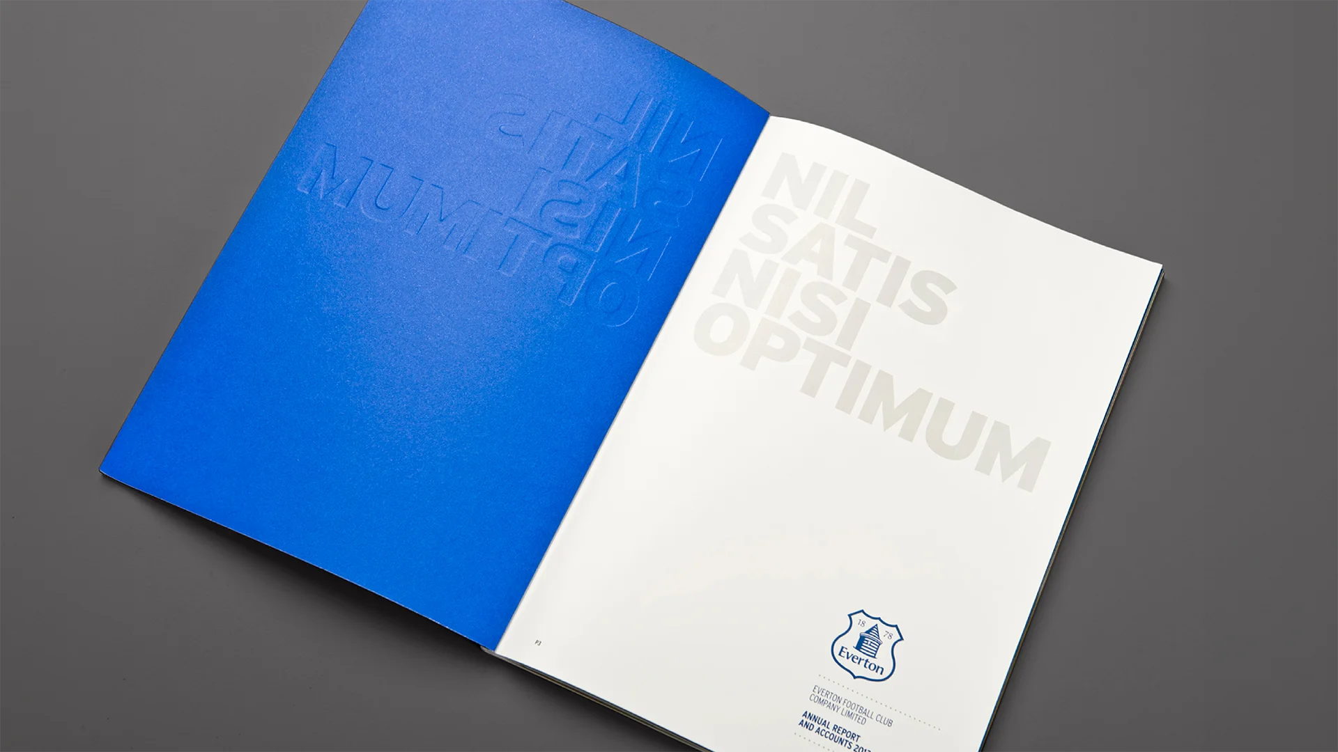
Supporter language changed season to season. The crest, colours and Nil Satis Nisi Optimum stayed fixed.
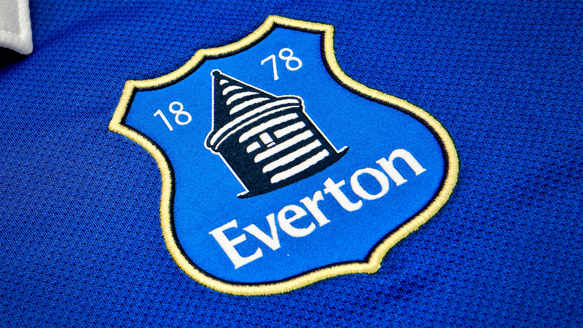
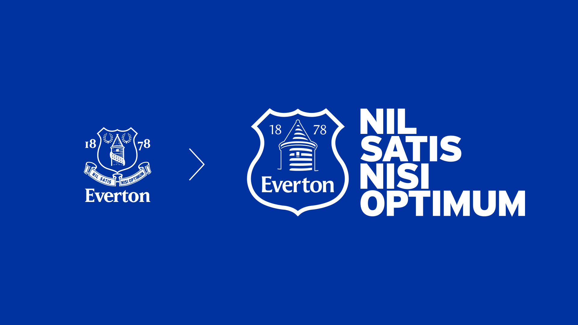
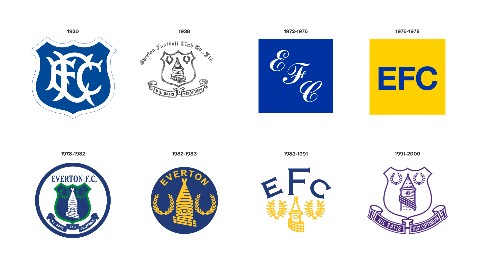
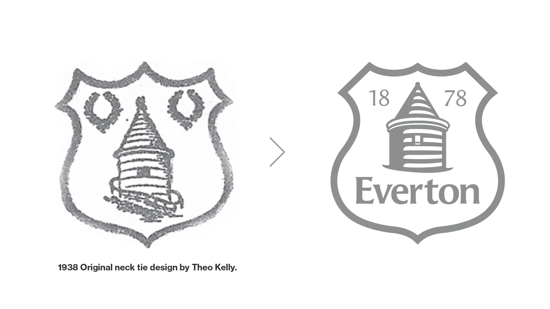
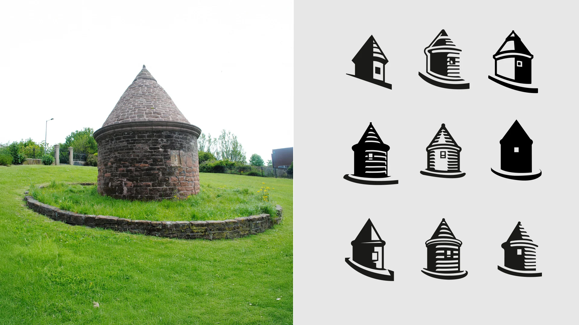
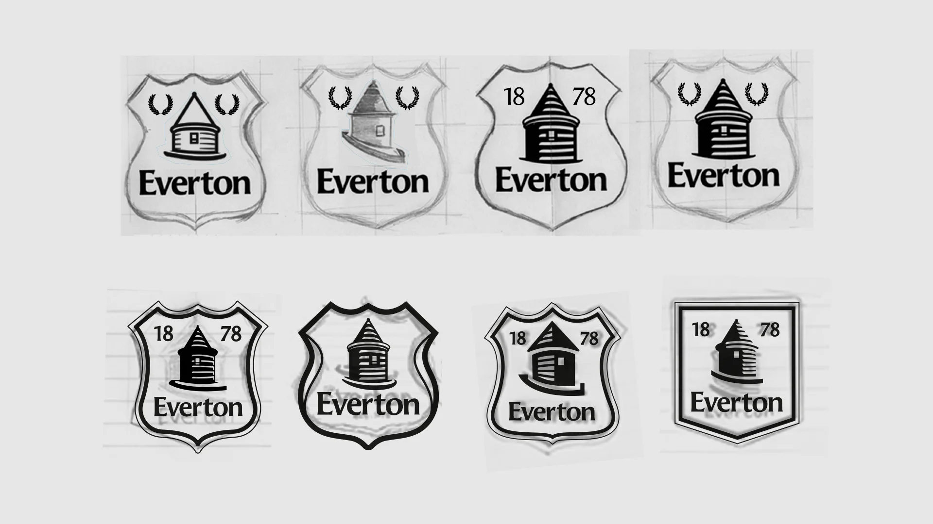
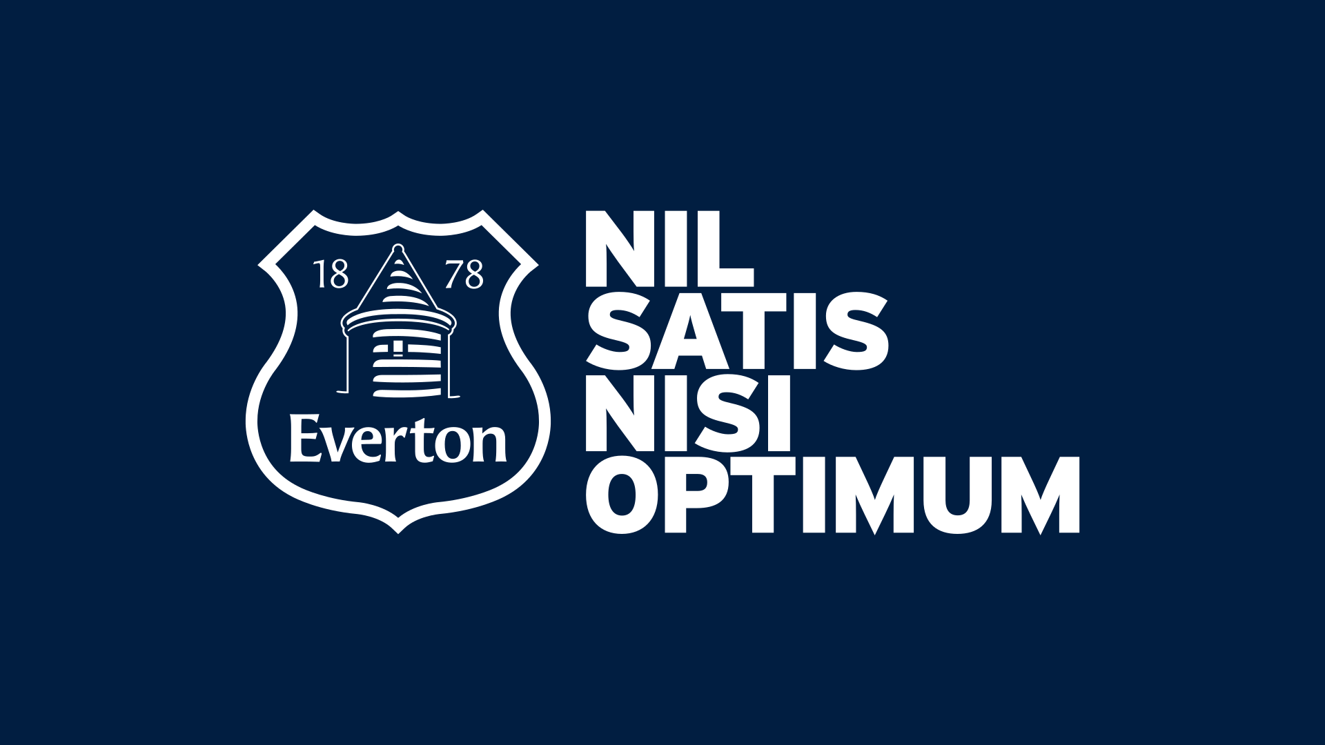
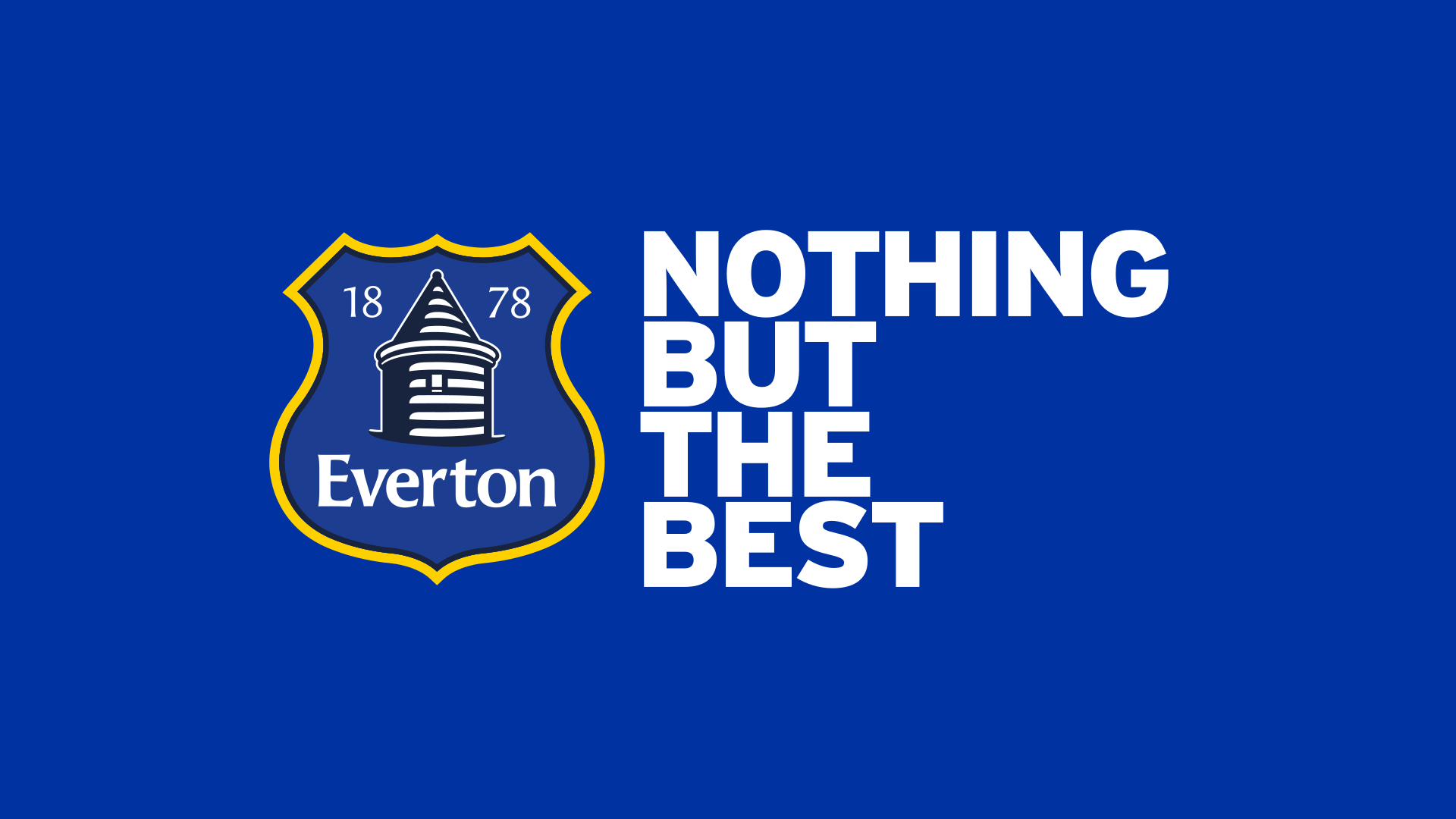
Heritage. Simplified. Elevated.
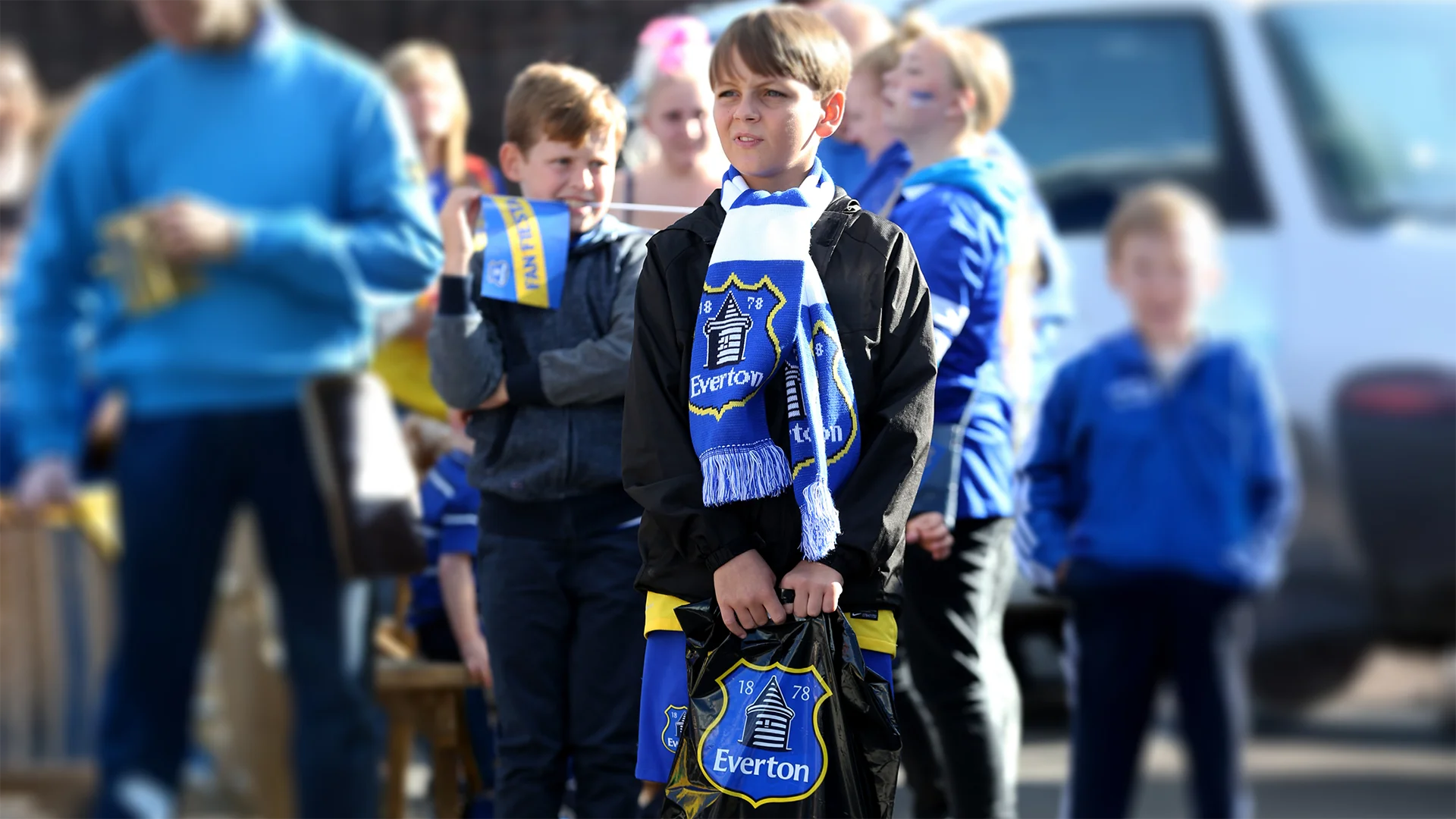
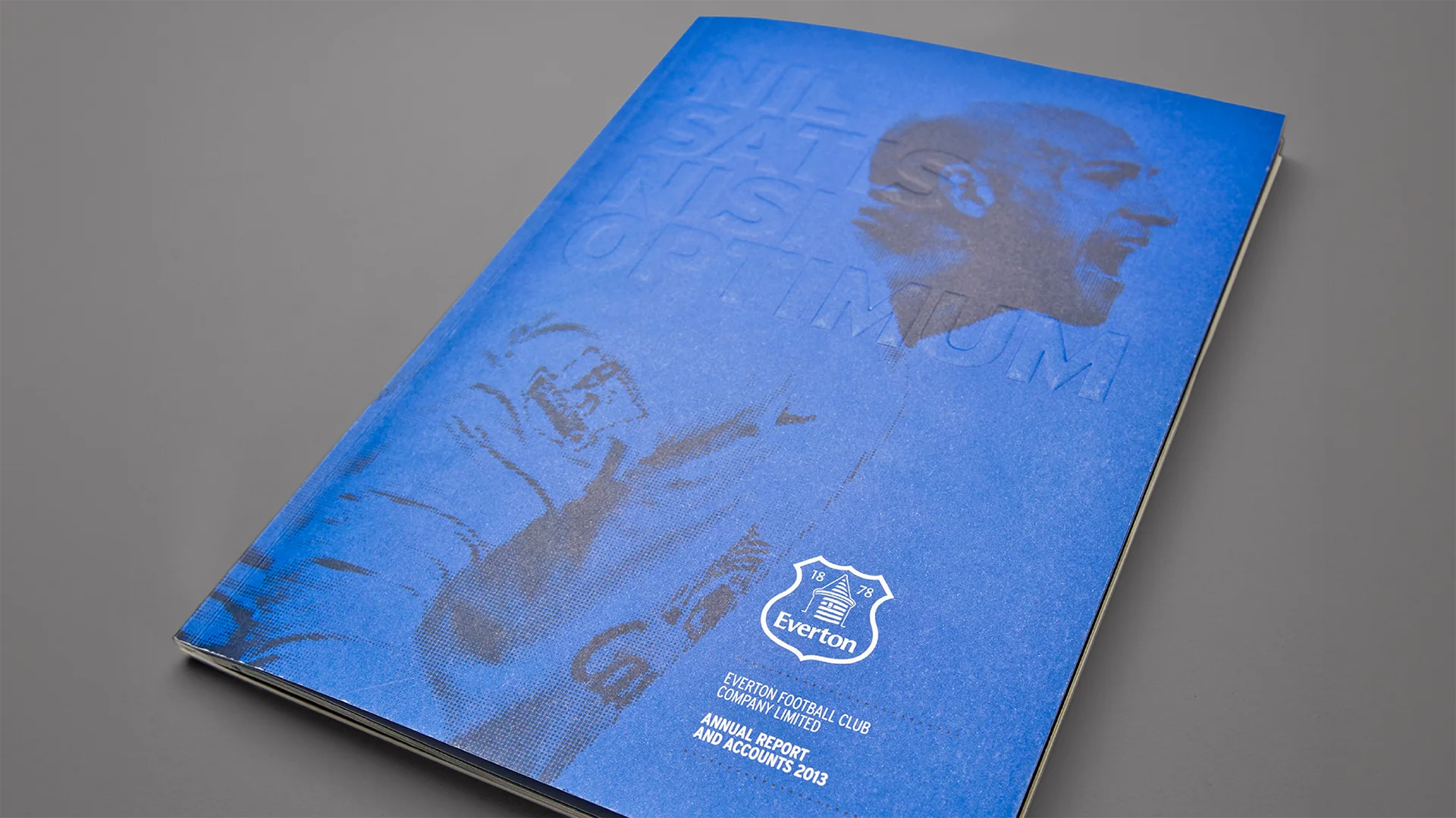
We redesigned the crest for clarity at every size, keeping the tower and 1878. The motto moved out of the crest and into everyday communications as a statement in its own right.
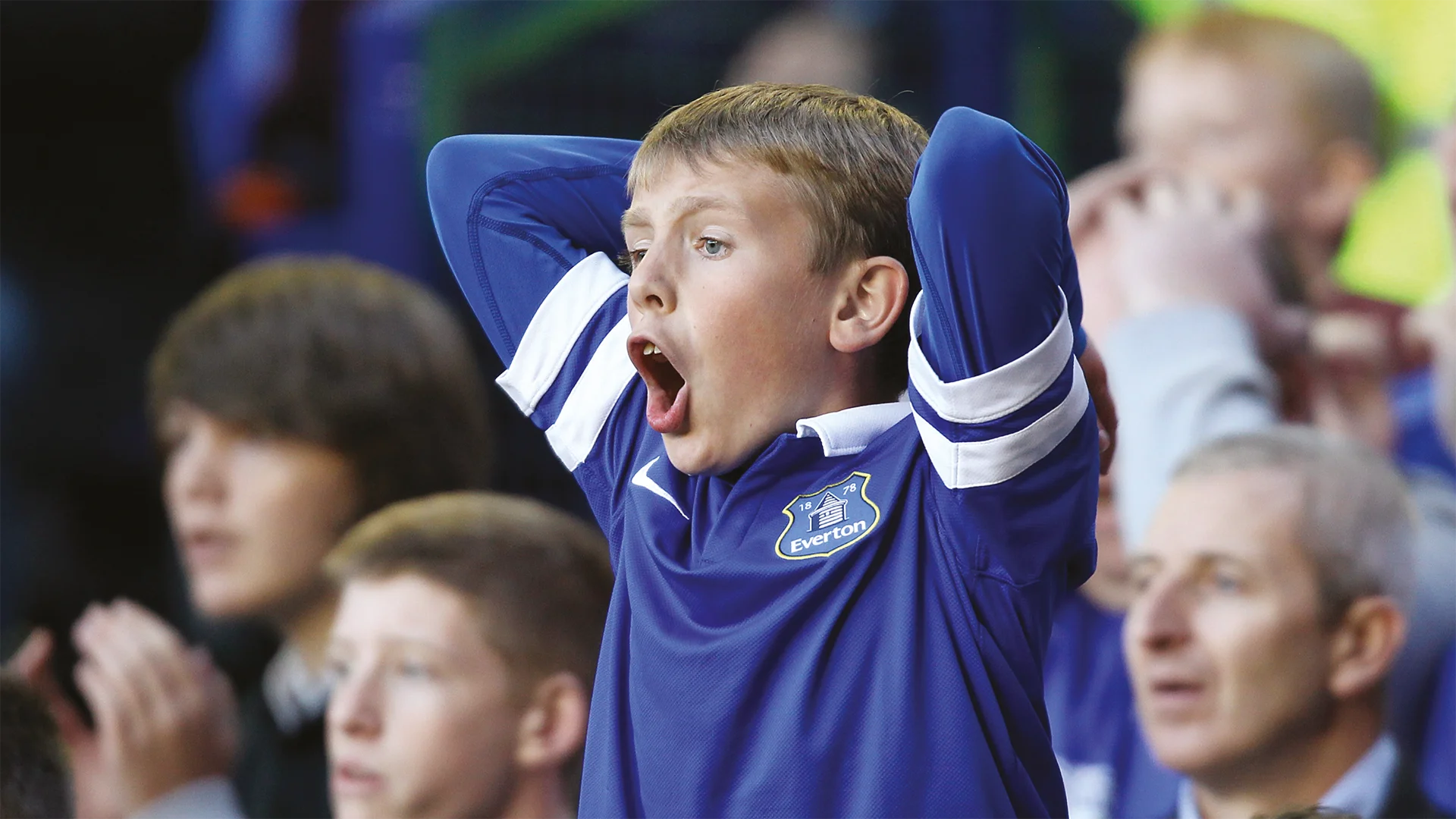
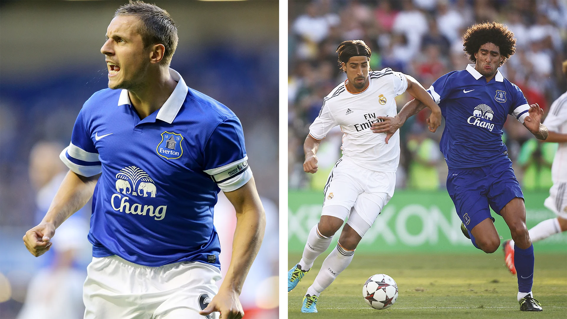
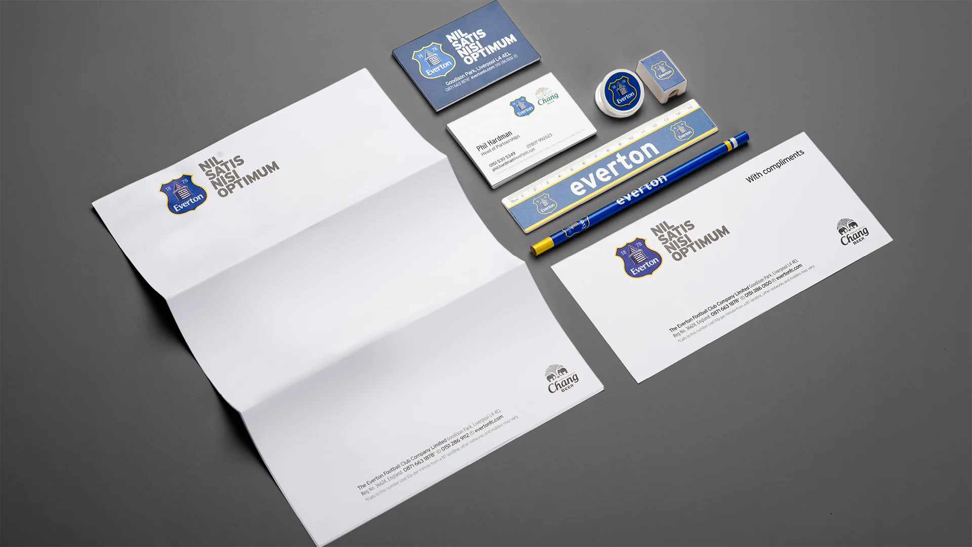
Applications
Shirts, scarves, signage, programmes: the fixed layer that let everything else flex.
03.—Structural Geometry
Built from the club’s architecture.
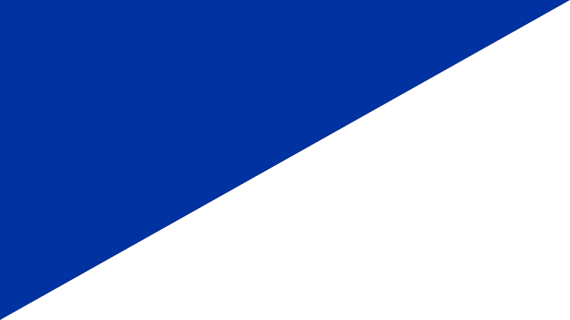
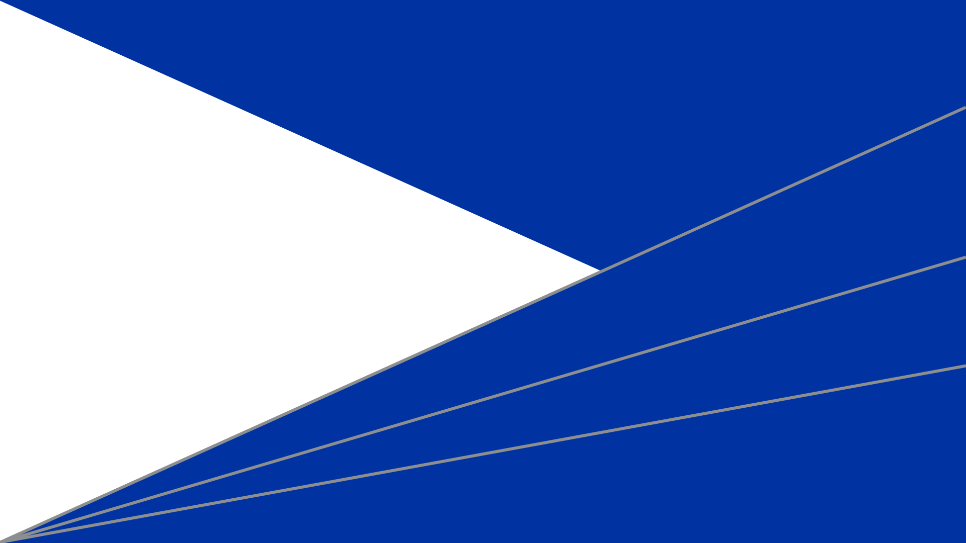
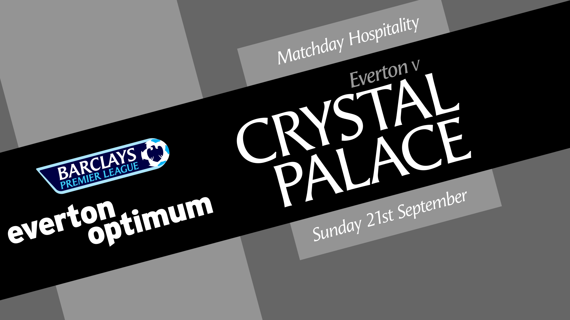
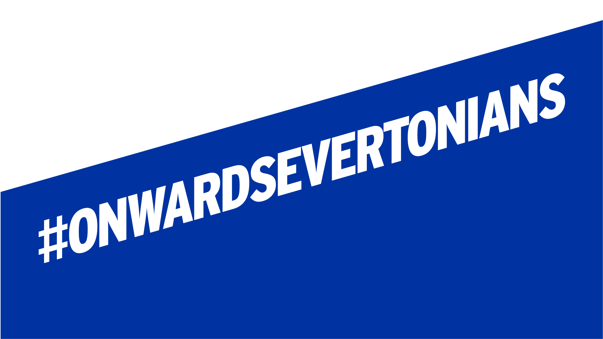
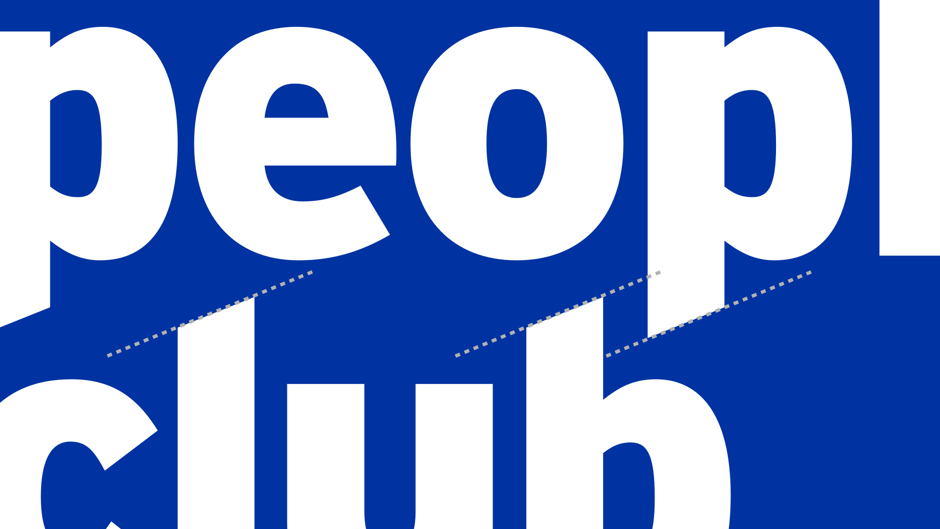
Every diagonal in the system comes from the X-bracing beneath Goodison’s stands.
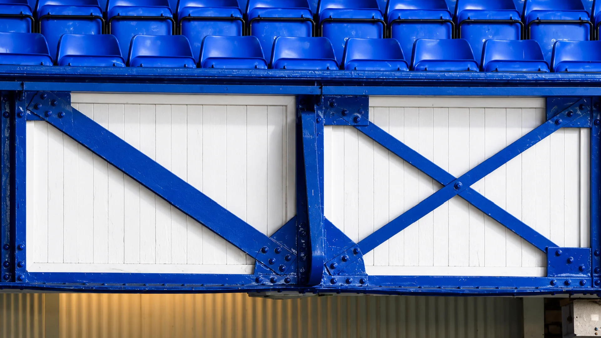

The Geometry
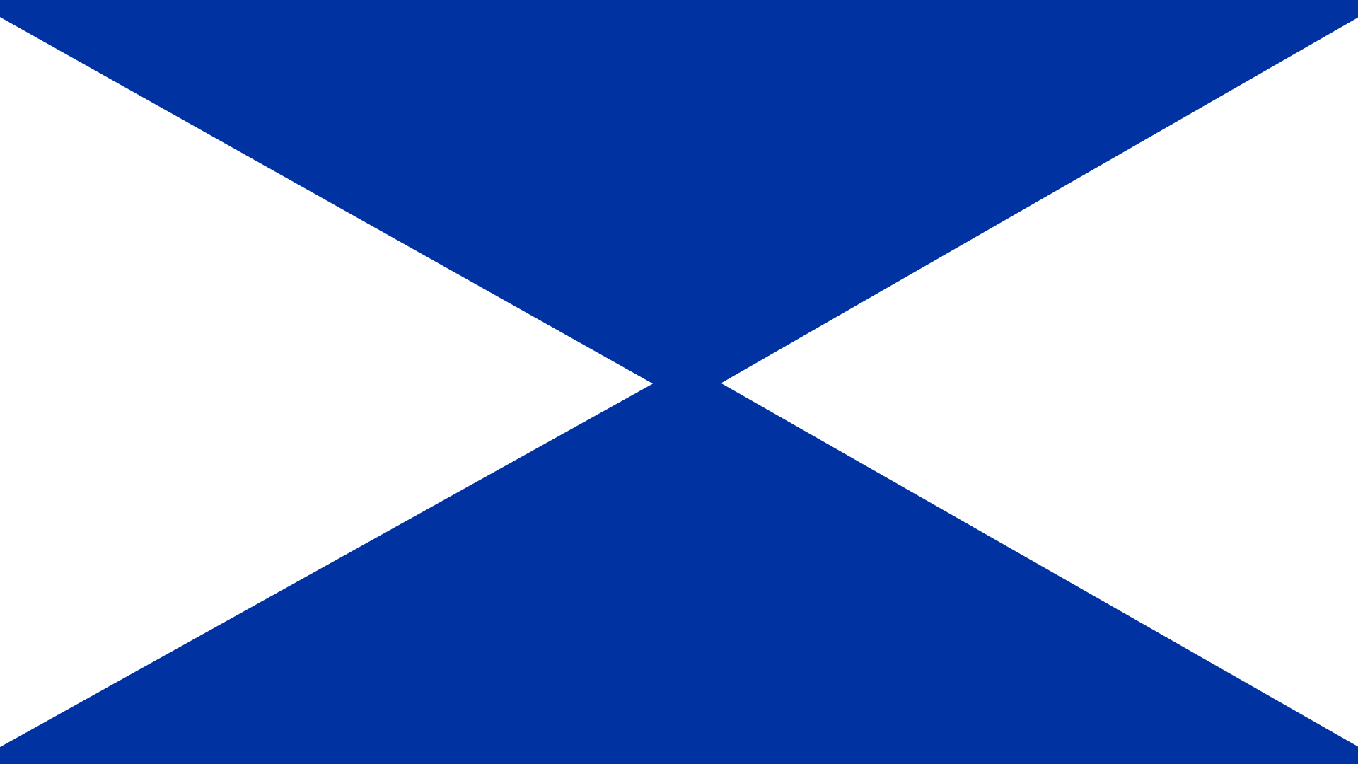
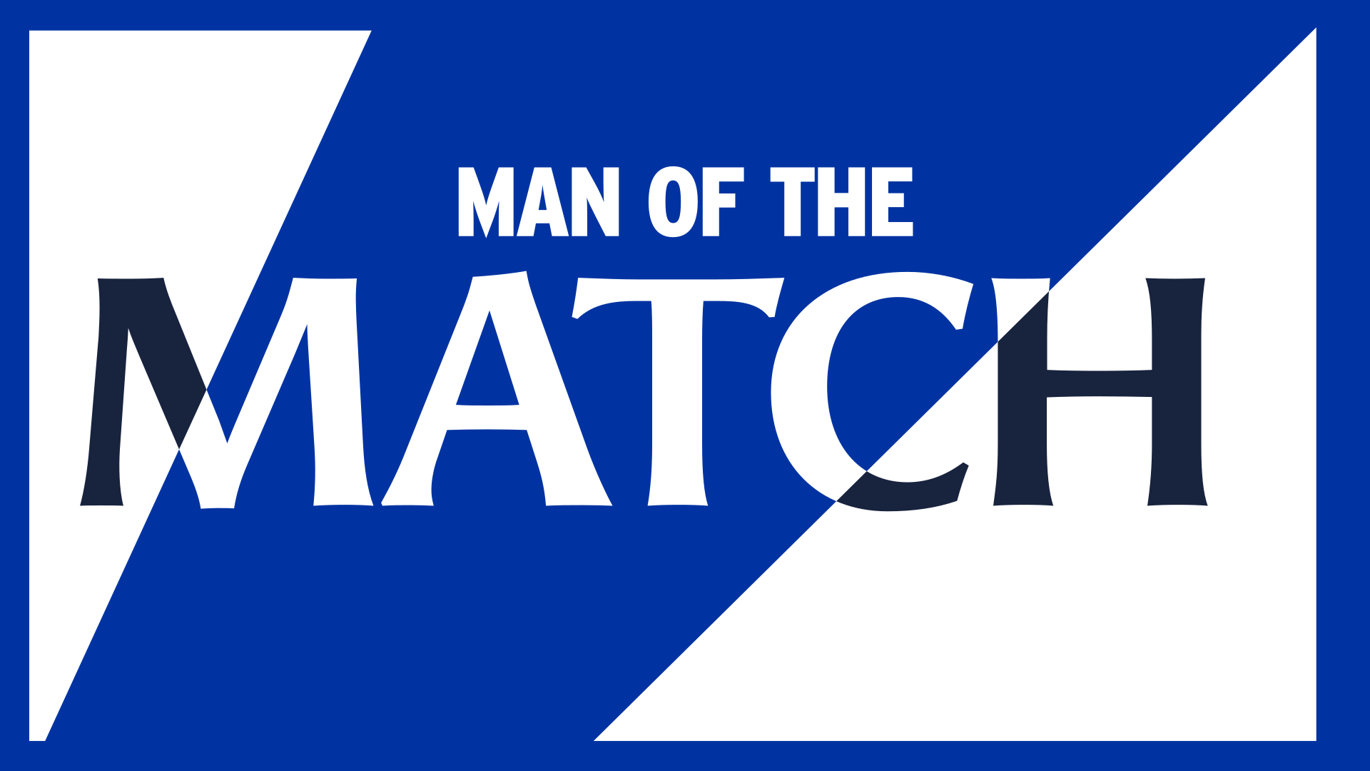
Broken into its parts (the cross, the single diagonal, the triangles either side), it became a kit for splitting the page and cutting through type.
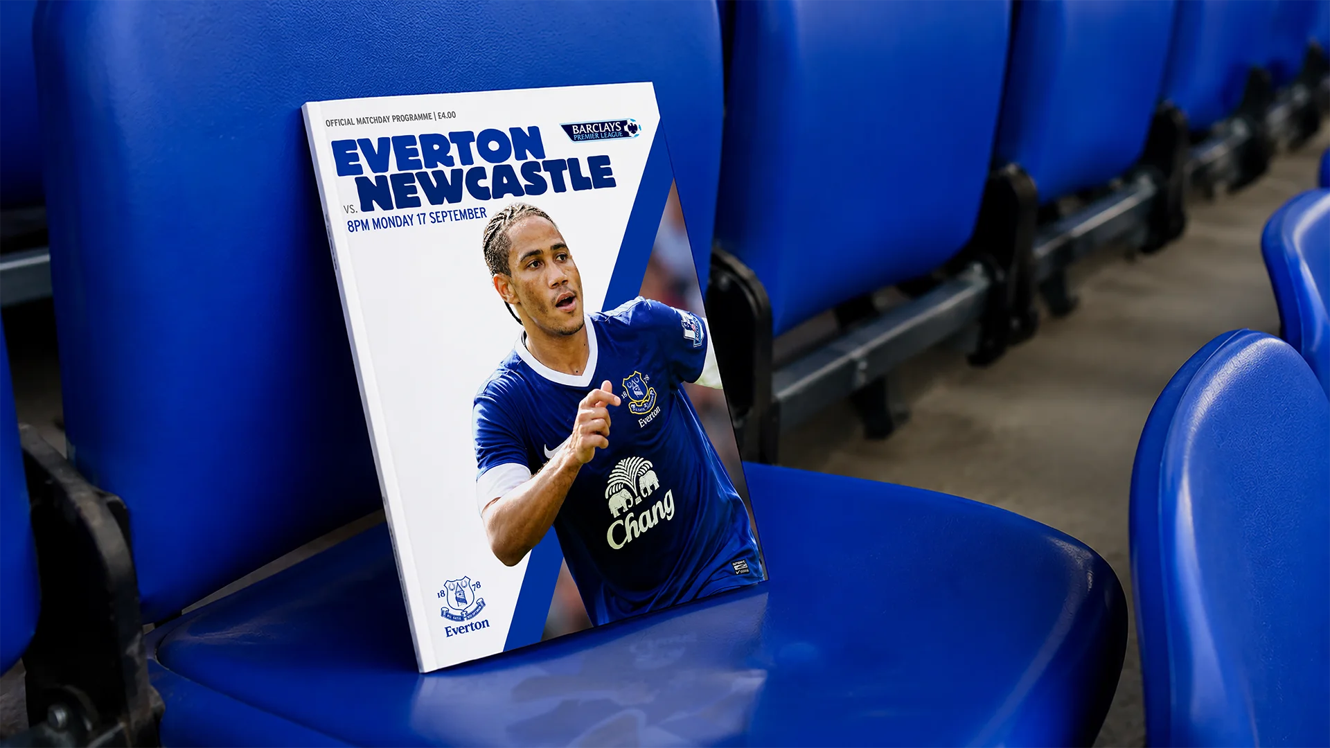
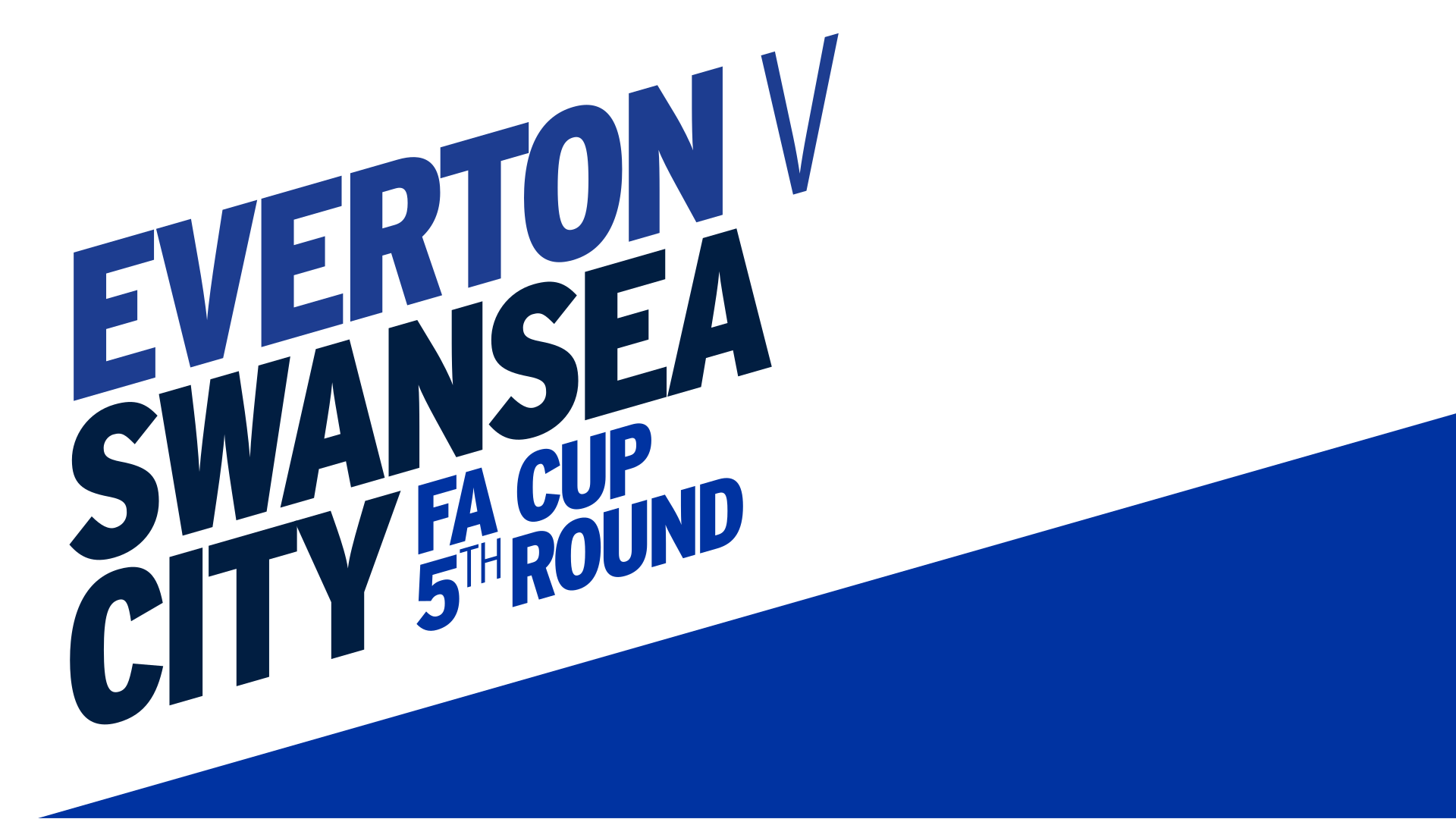
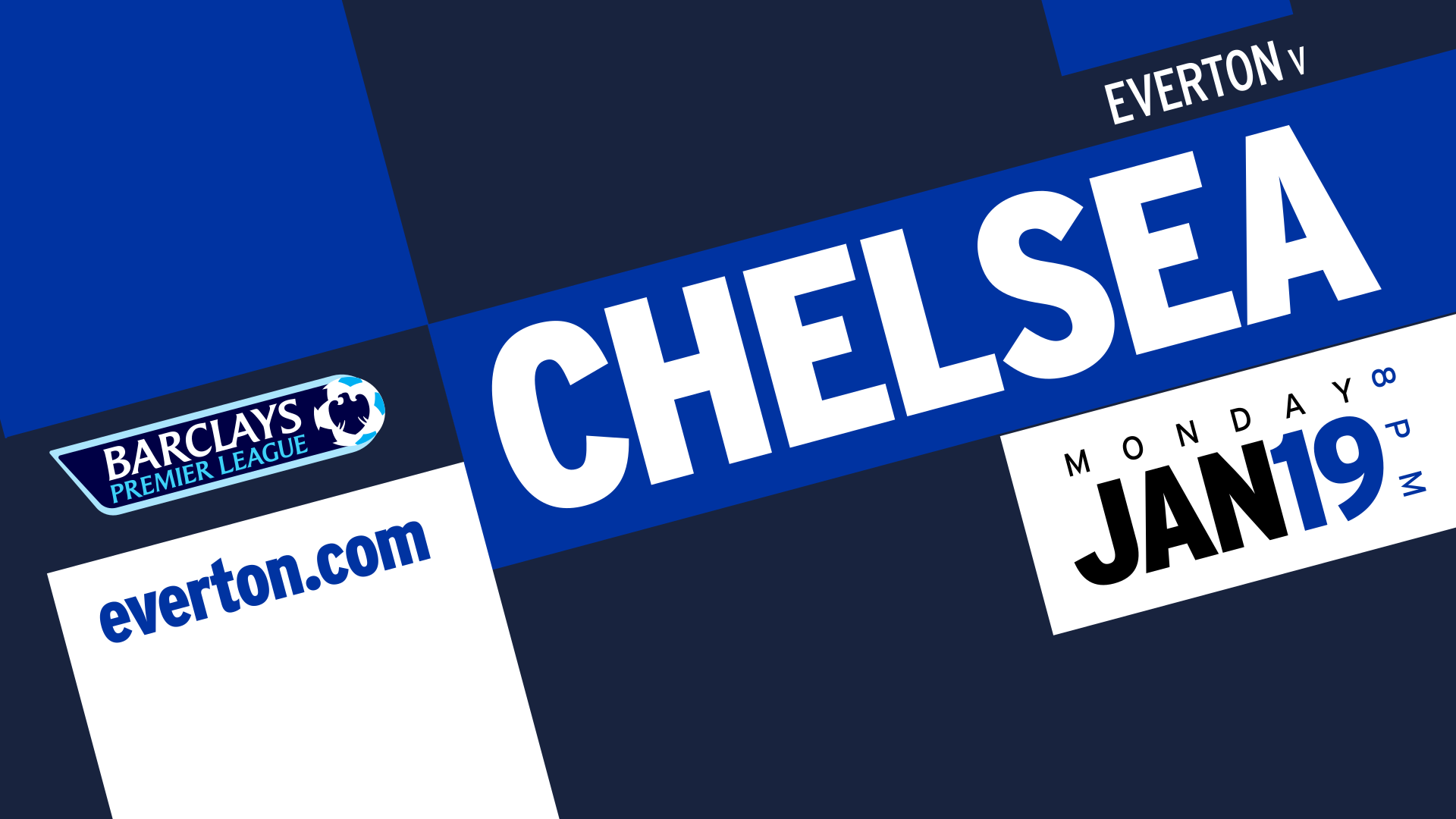
Matchday Layouts
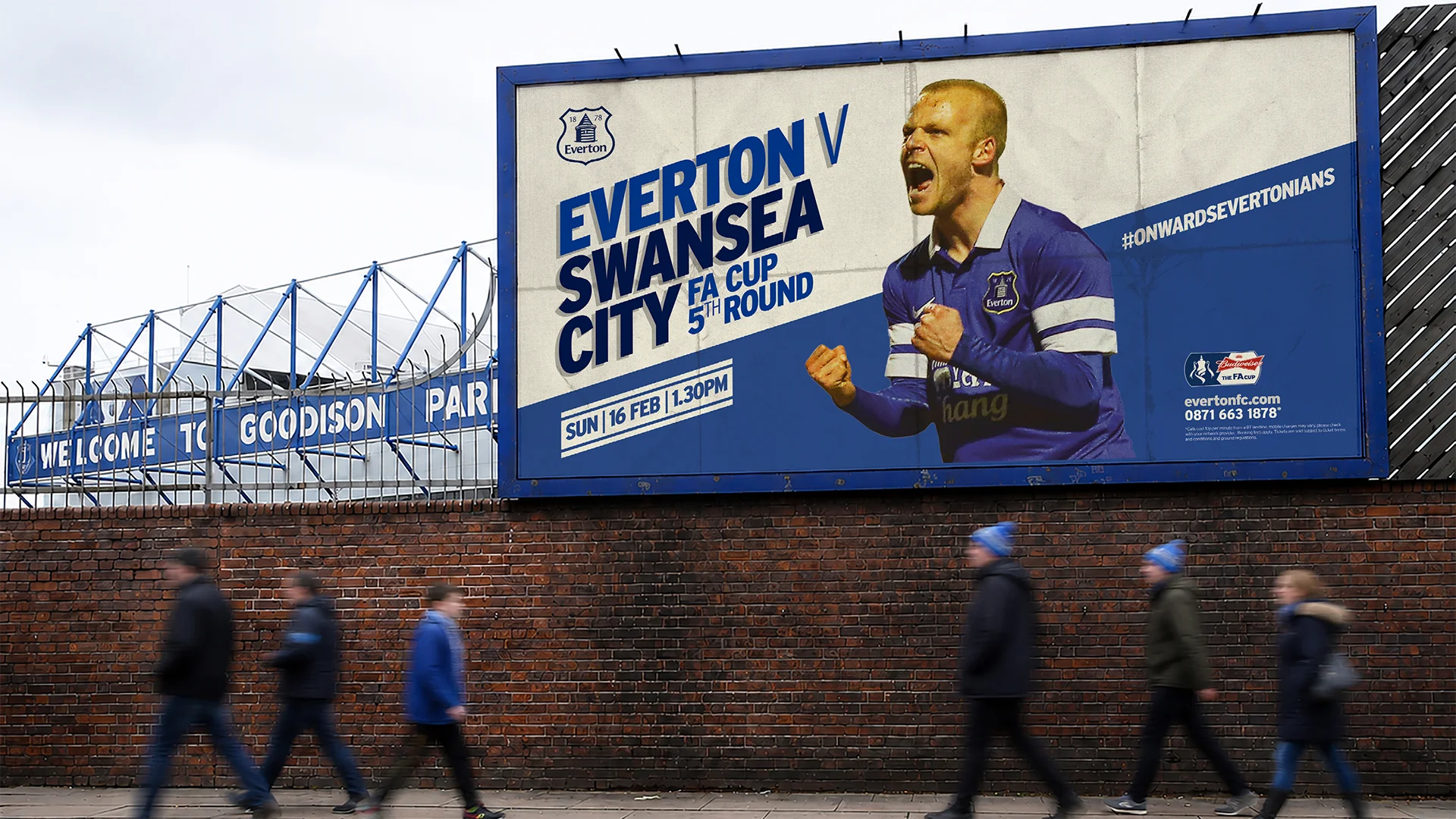
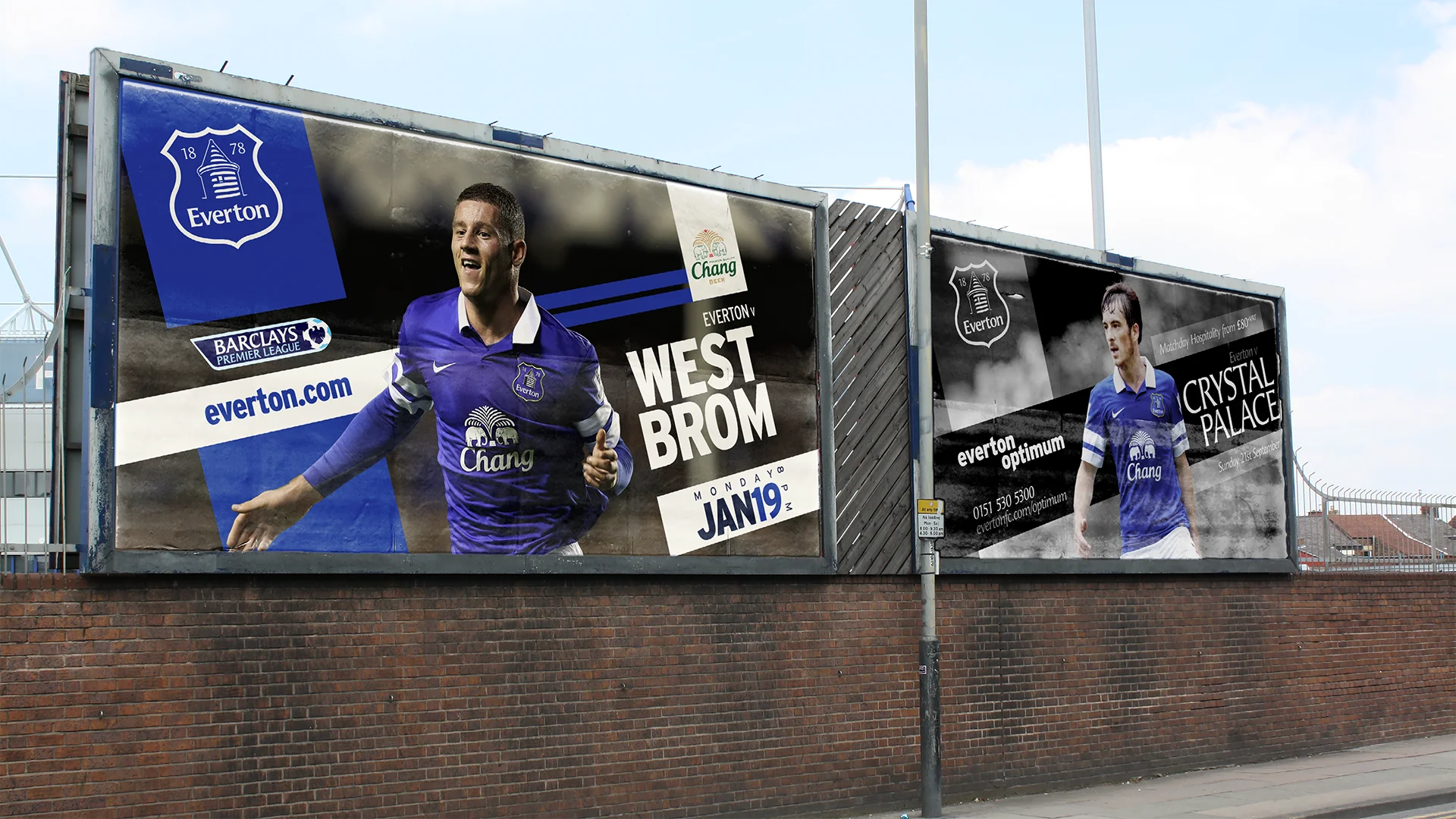
One framework for every fixture. The angle and colour split stayed fixed; the player, opposition and date changed week to week.
04.—Outcome
A supporter-led identity built from fan culture.
Over six years the identity ran across every part of the club: matchday, campaigns, membership and, finally, the crest itself. The work won Football Marketing Awards in four of those six years.
Credit
Creative Direction & Art Direction:
Nigel Payne
Crest Redesign, Brand Development, Style Guide and Campaign Concepts & Art Direction:
Mark Derbyshire
Marketing & Commercial Direction:
Everton Marketing Department.
Mark Derbyshire
+Design Director © 2026