
Khazna.
Data Centre
A confident new identity for one of the UAE’s fastest-growing data centre operators.
Industry
Technology & Data Infrastructure
Role
Senior Designer
Agency
James Branding
Project Type
Logo, Wordmark & Identity Concepts
Status
Finalised & Live
The challenge
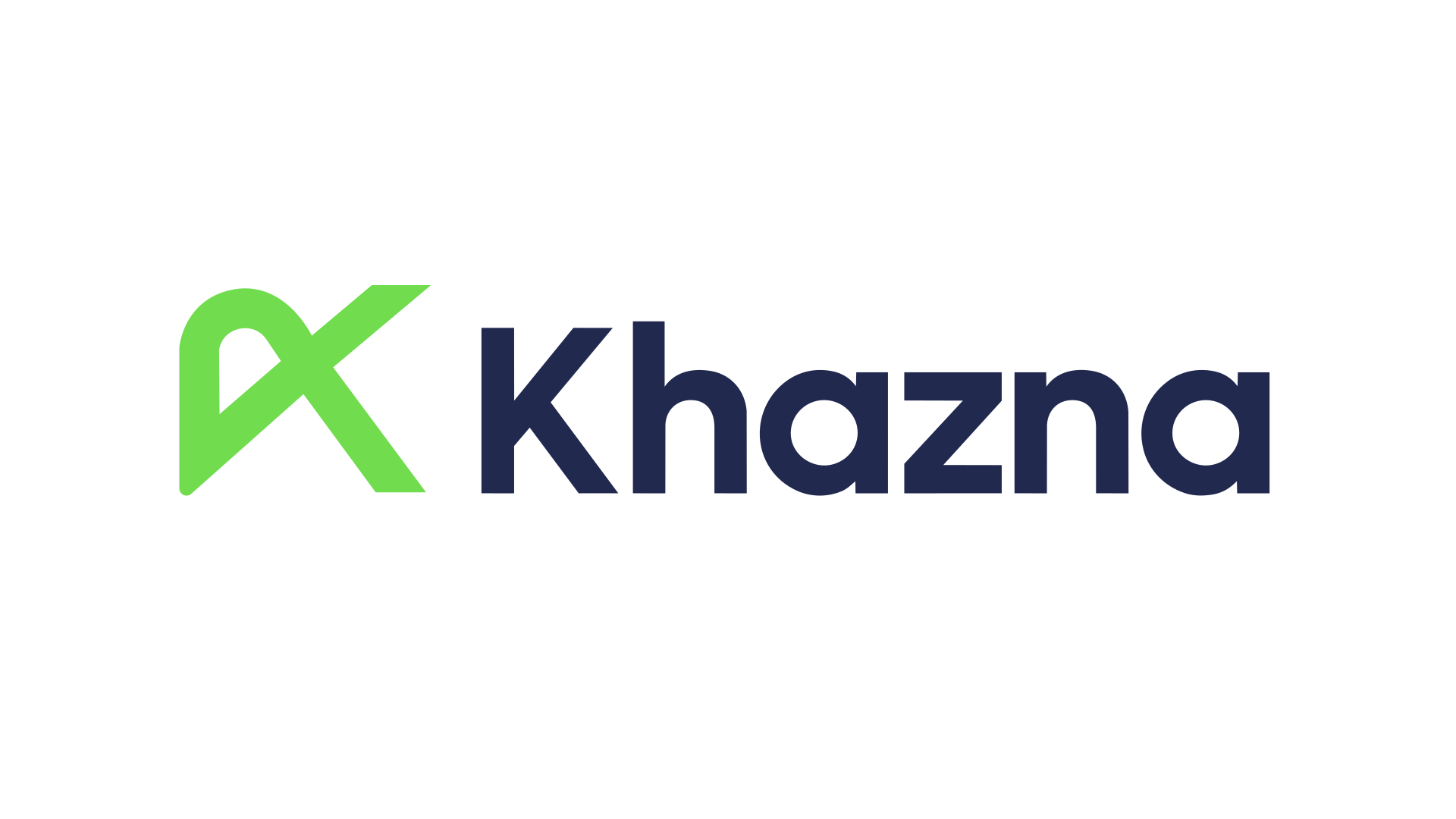
Khazna needed an identity with the confidence to match its growth, and the character to stand apart from a crowded landscape of generic tech marks.
My Role
As Senior Designer, I created the logo, wordmark and icon concepts, including the selected K monogram. These became the basis for Khazna’s wider design system.
Strategic translation
The brand essence, Connect Further, translated into a single continuous form.
Identity system
A custom K monogram drawn as one unbroken line, echoing infinity and the constant movement of data.

System architecture
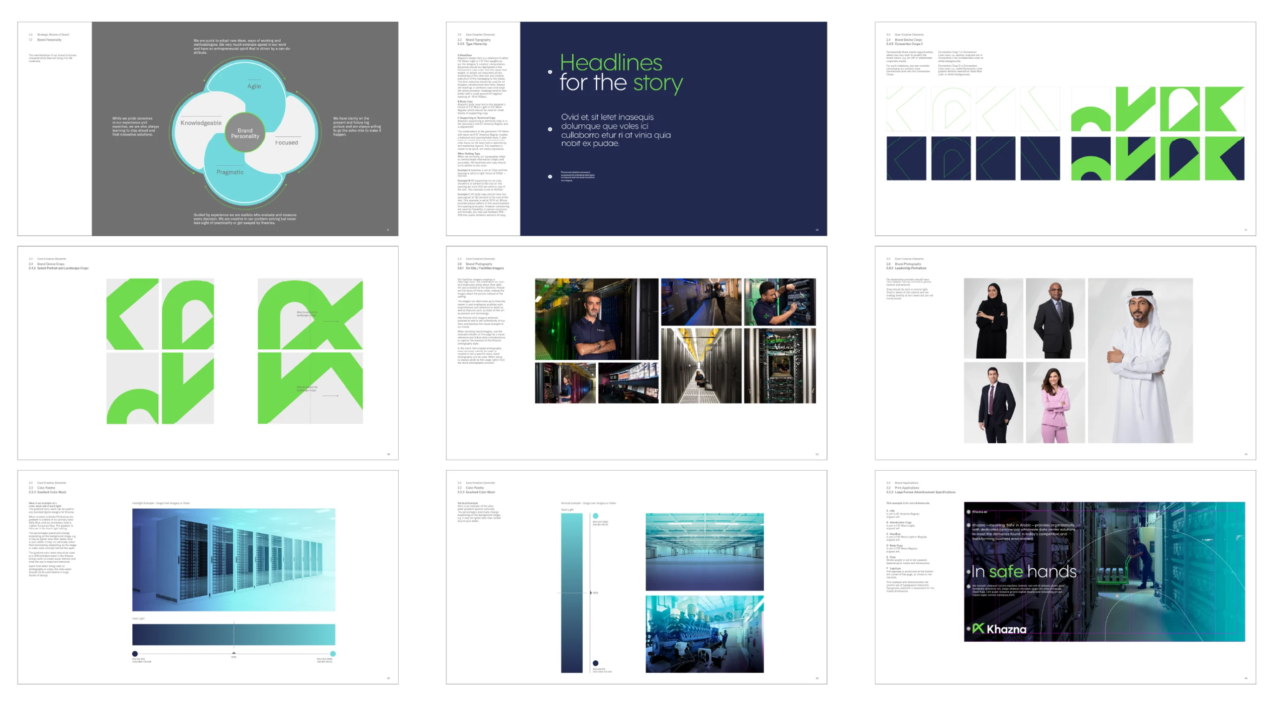
The K is built from a single continuous line, and that form became the basis of the wider system. Cropped and scaled, the mark works as a brand device for framing imagery across formats, with fine connection lines drawn from the same shape carrying the idea through layouts.

Typographic & colour framework
A sharp green set against deep navy gives the identity energy and authority, with clean, open typography keeping it modern and legible.
Application & rollout
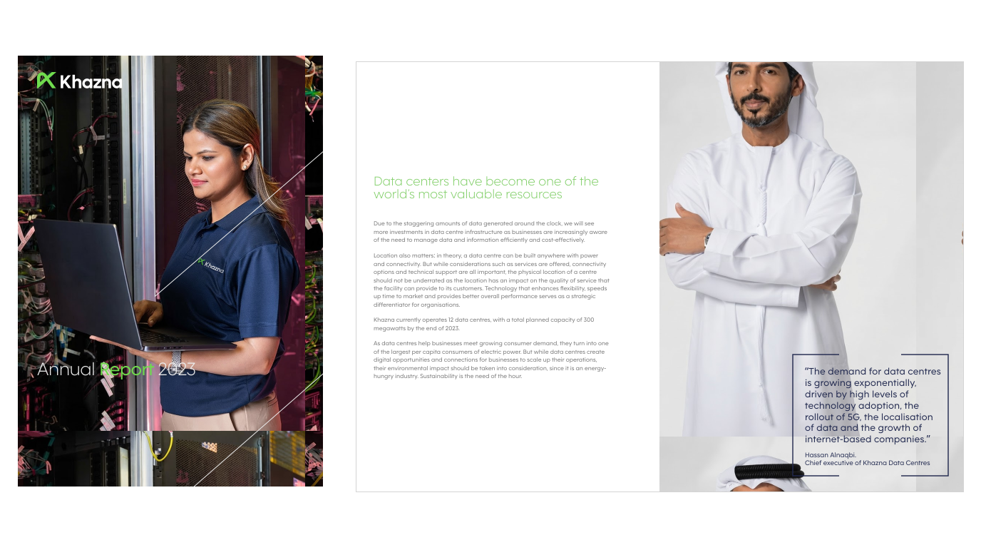
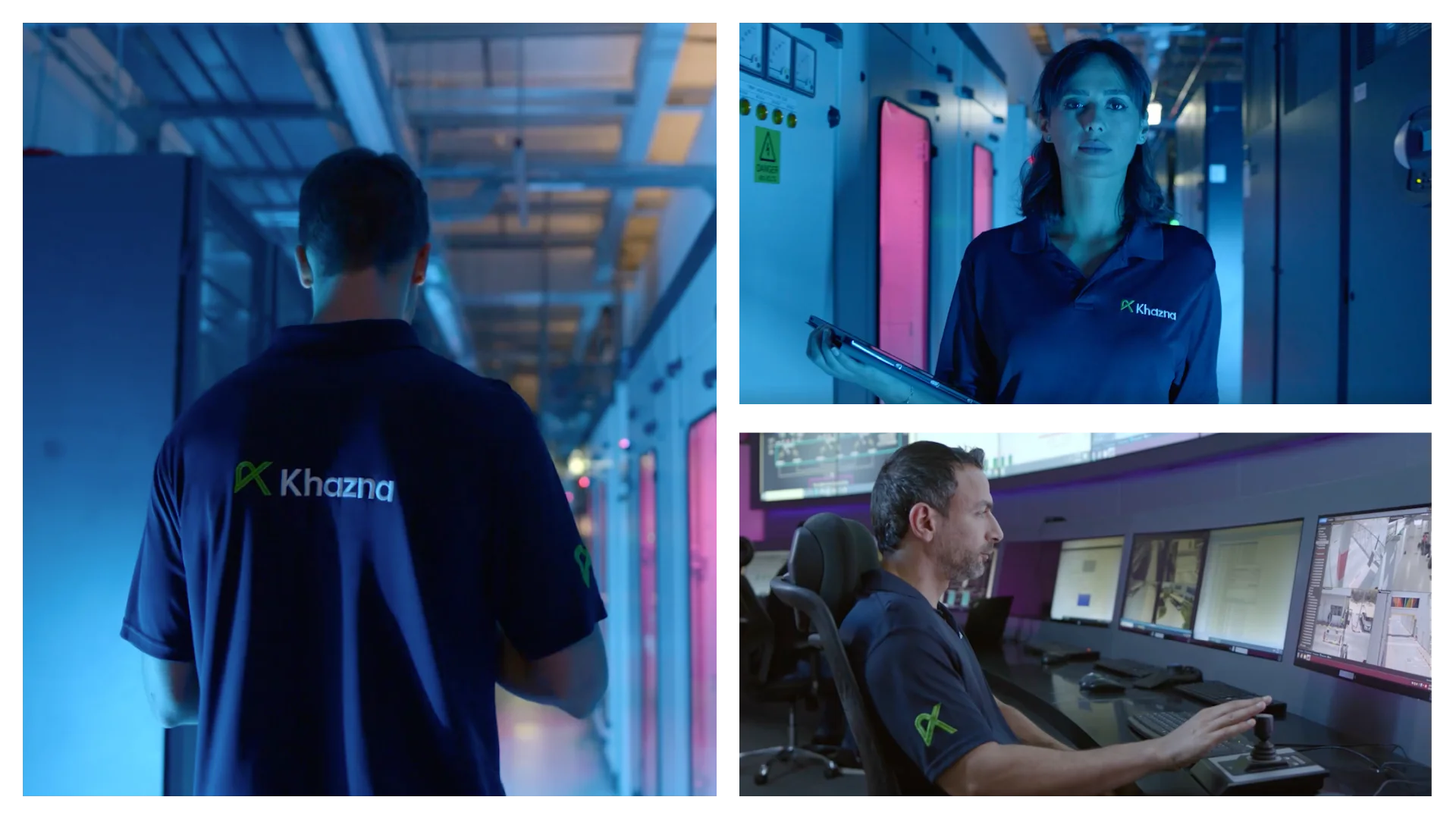
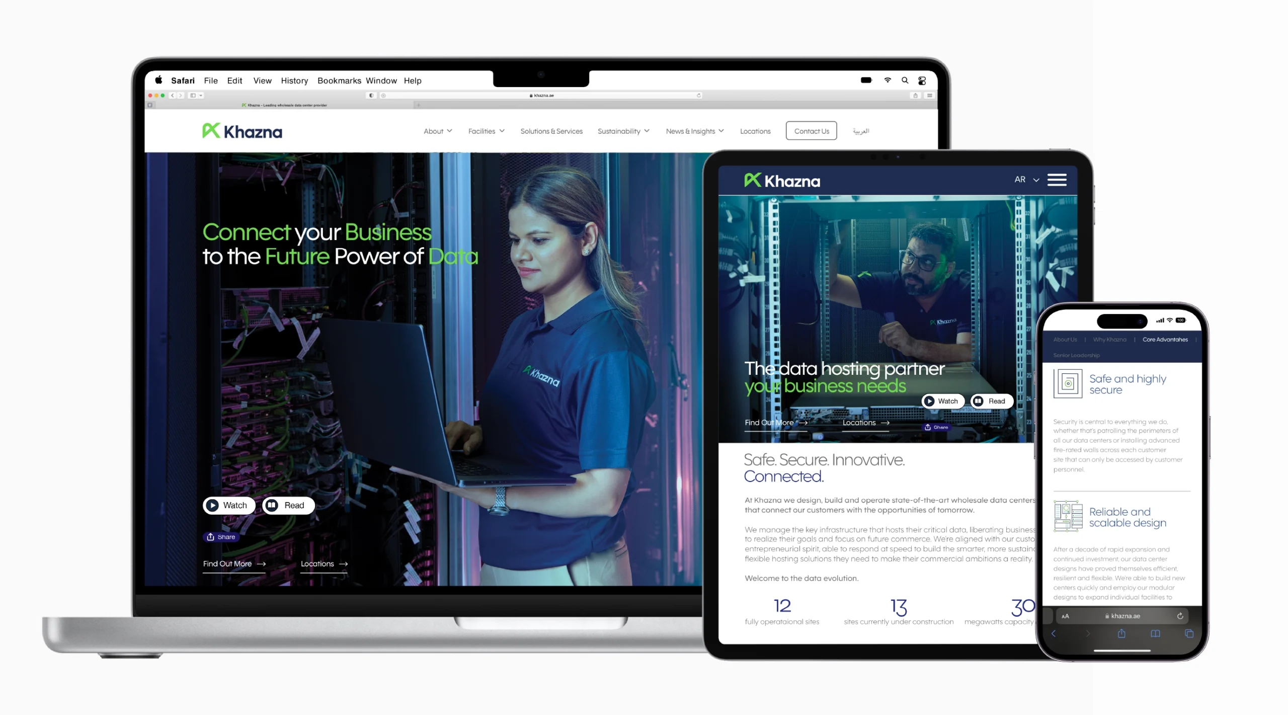
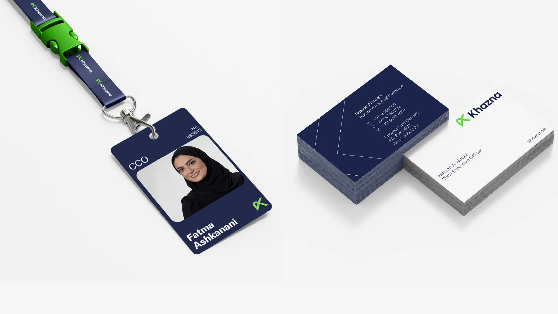
Applied across digital, print, uniform and campaign touchpoints, from website and social to annual reports and staff ID.

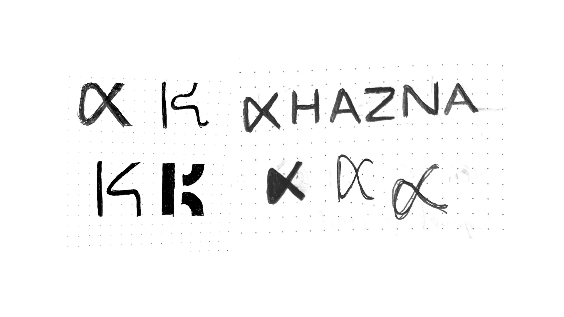
Selected exploration
Extensive sketching across letterform, connection and data-flow routes before refining the selected direction.
Governance
The James Branding team developed the full guidelines from the mark, keeping the idea consistent as Khazna expands.
Credit
Creative Direction: Russel James
Brand Strategy & Guidelines: James Branding team
Logo, Brand Mark & Icon Concepts: Mark Derbyshire
Mark Derbyshire
+Design Director © 2026